

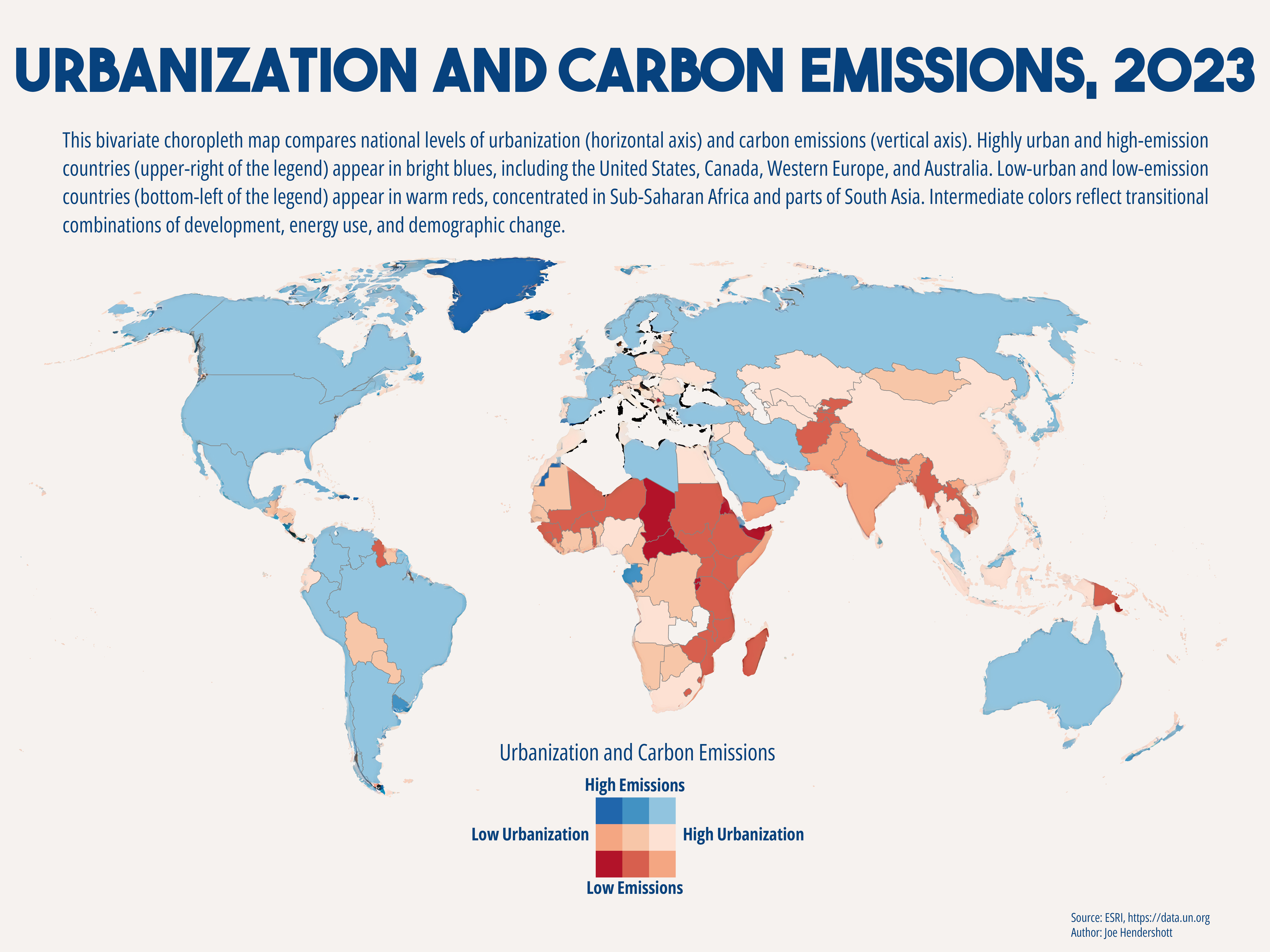
This bivariate choropleth map visualizes the relationship between urbanization (% urban population) and annual carbon emissions using country-level data from the United Nations Data Portal and ESRI’s global administrative boundaries. Both variables were classified into three equal-interval categories, producing a 3×3 matrix of nine color combinations. Blue hues represent higher emissions, red hues represent higher urbanization, and blended shades show intermediate conditions.
The map was projected using the World Robinson coordinate system to provide a visually balanced global view. Data was cleaned and joined in ArcGIS Pro, then symbolized using a custom bivariate color scheme created in the Color Scheme Editor. The final map highlights broad global patterns, such as high-urban/high-emission countries in North America and Western Europe, and low-urban/low-emission countries in Sub-Saharan Africa.
Comments
No comments yet.