

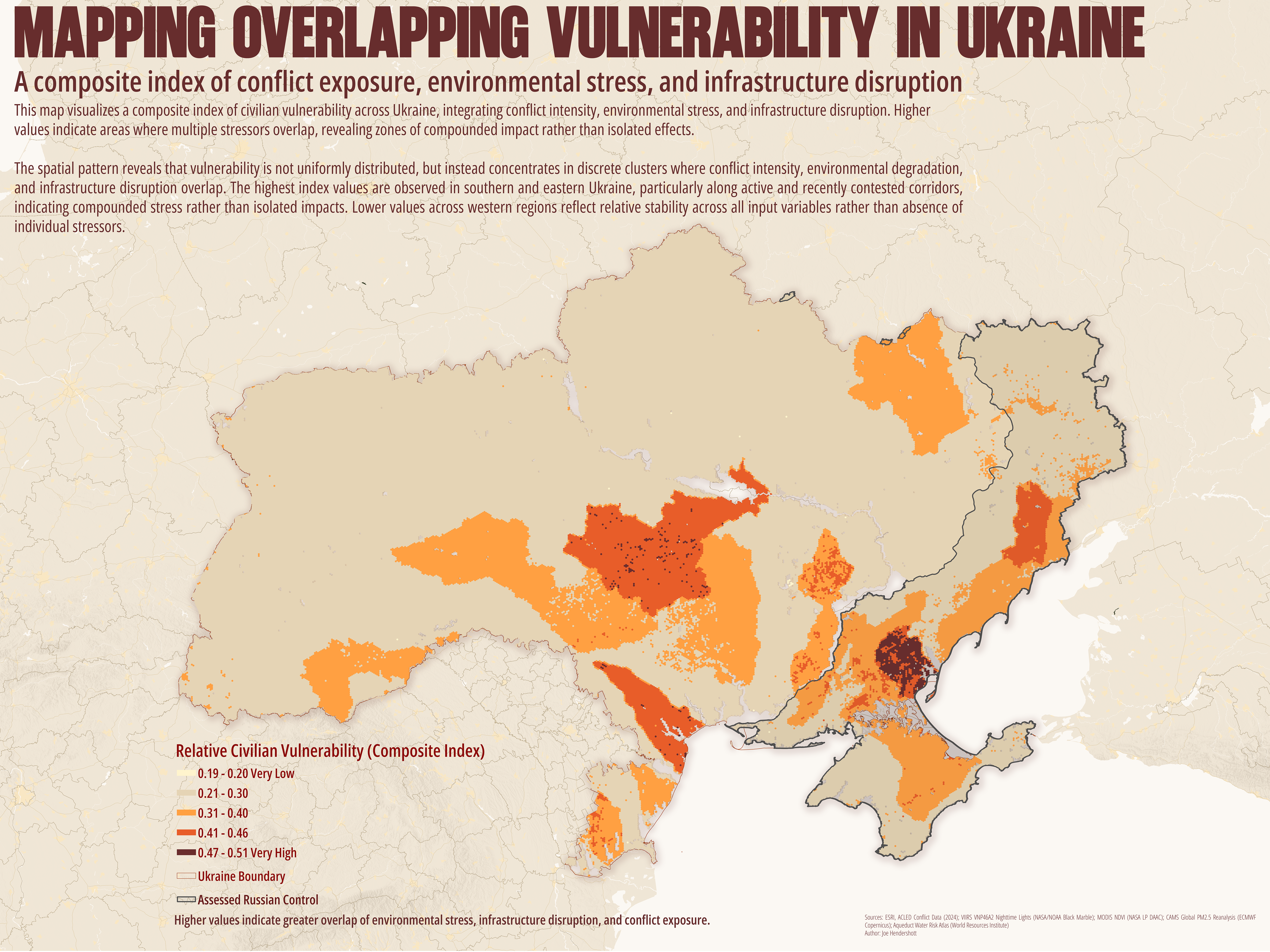
After completing the civilian vulnerability poster I decided to attempt combining the five factors into a single composite index of vulnerability.
This map presents civilian vulnerability in Ukraine using a composite geospatial index that combines multiple layers of crisis exposure. Indicators include conflict intensity (ACLED events), infrastructure disruption (VIIRS nighttime lights), environmental stress (NDVI change and PM2.5 concentrations), and water risk (AquaDuct). Each dataset was normalized and aggregated to a 5 km hexagonal tessellation to create a consistent spatial framework for comparison. To preserve continuous spatial coverage, null values in select datasets were recoded to zero, representing absence of observed impact rather than missing data.
The resulting map reveals that vulnerability is not evenly distributed but instead concentrated in distinct geographic clusters, particularly in eastern and southern Ukraine, where conflict activity, environmental degradation, and infrastructure disruption intersect. Rather than highlighting any single factor, the composite index captures the cumulative burden experienced by civilian populations. This approach emphasizes the importance of overlapping stressors in shaping humanitarian risk and provides a spatial tool for understanding where compounded vulnerabilities are most acute.
Geography Joe April 10 2026Cartography, Analysis
Mapping Overlapping Vulnerability in Ukraine
Geography Joe February 19 2026Cartography, Analysis, Health, Cities
Network-Based Primary Care Accessibility in Metro Atlanta
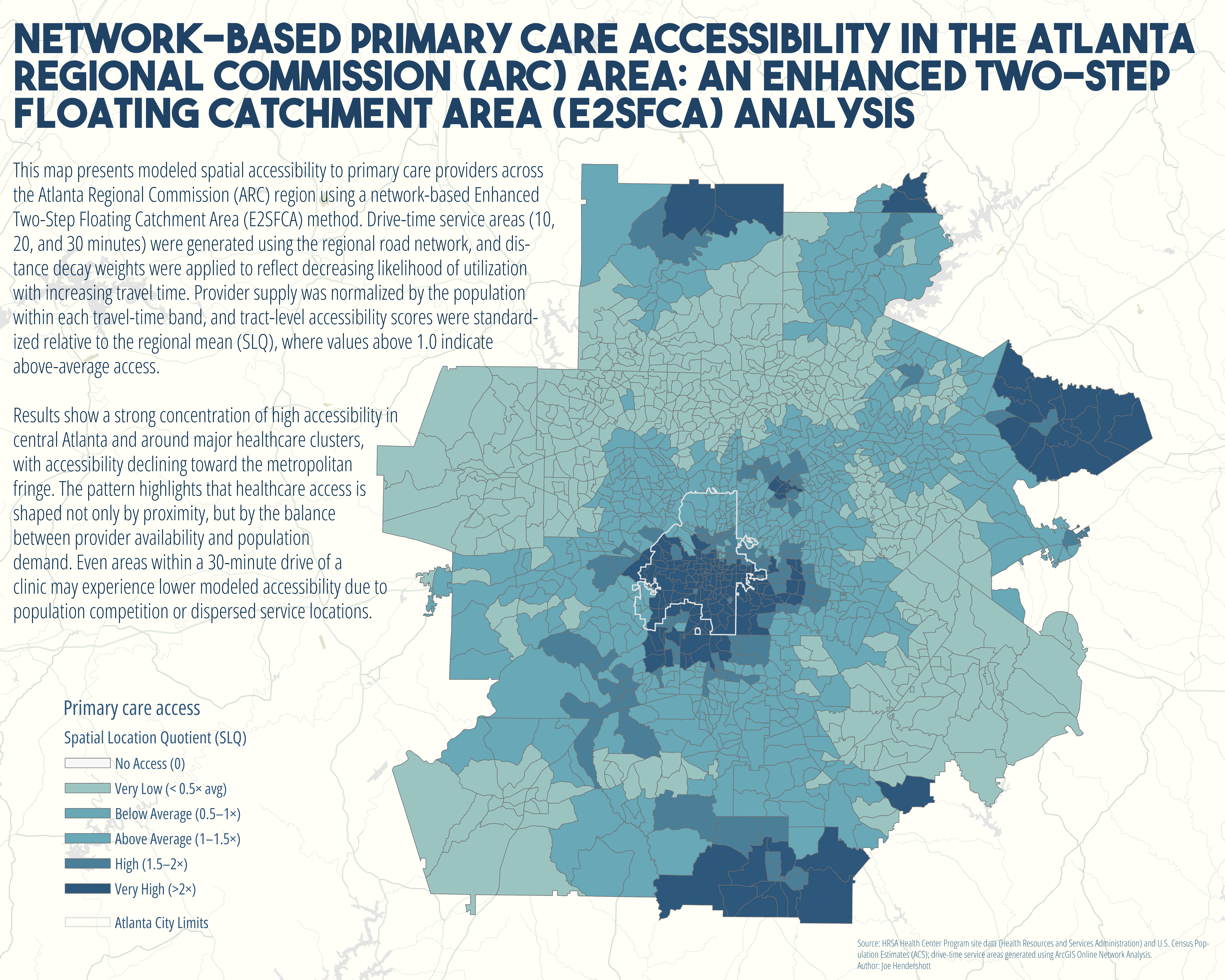
I recently completed a network-based spatial accessibility analysis of primary care providers across the Atlanta Regional Commission (ARC) region using an Enhanced Two-Step Floating Catchment Area (E2SFCA) model.
Instead of simple buffers, I used real road-network drive times (10, 20, and 30 minutes) and applied distance decay weighting to account for how utilization likelihood decreases with travel time. Accessibility was modeled as a function of both provider supply and competing population demand, then standardized relative to the regional average.
The results show a clear concentration of high accessibility in central Atlanta and around major medical clusters, with accessibility declining toward the suburban fringe. Even within a 30-minute drive shed, differences in provider density and population competition create meaningful variation in modeled access.
This approach moves beyond descriptive mapping and into quantitative spatial modeling of healthcare availability, an important step for evaluating equity, infrastructure distribution, and urban service capacity.
Geography Joe January 31 2026Cartography, Analysis, Health
Urban Context and Cardiometabolic Health in Chicago
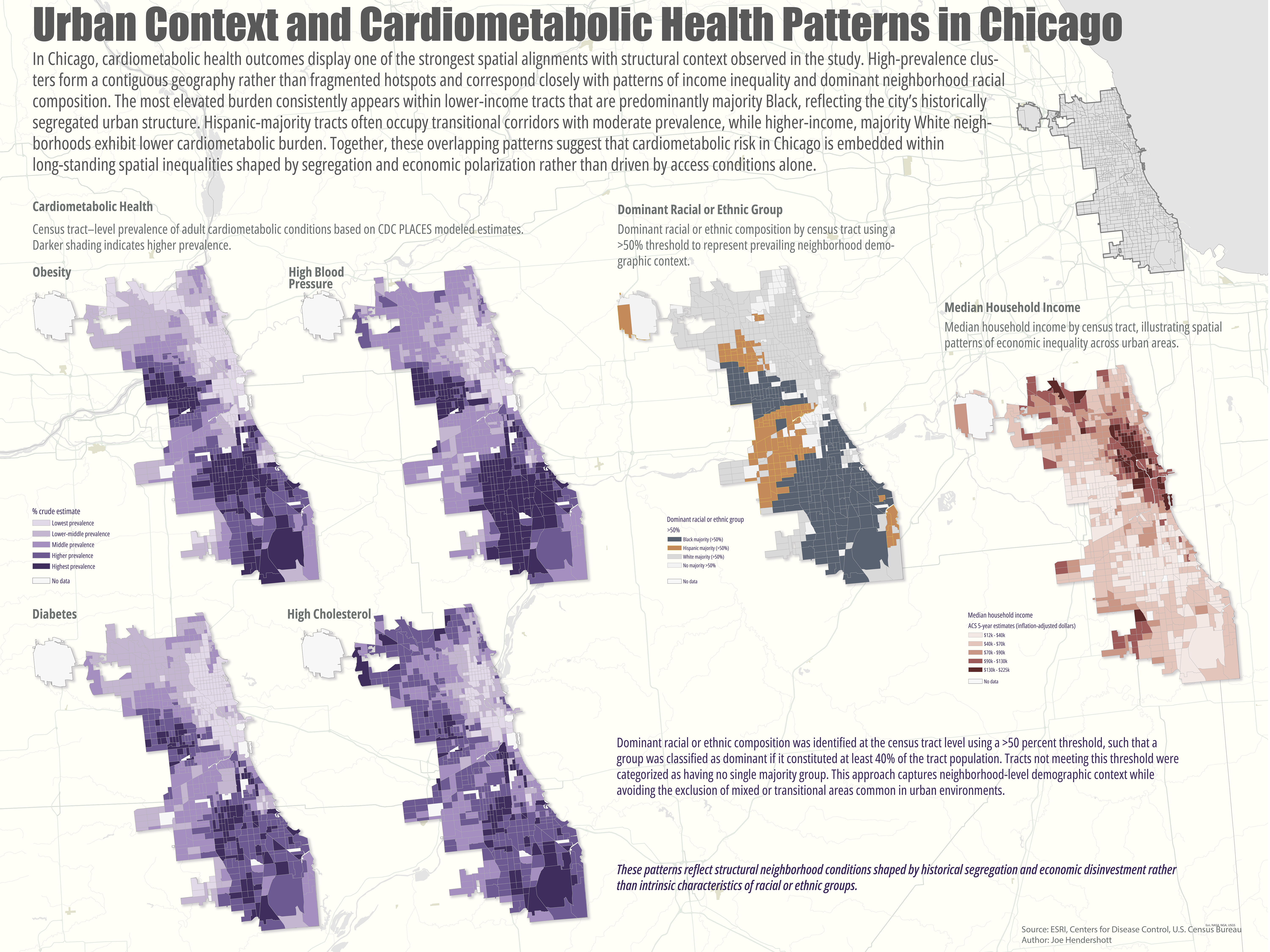
In Chicago, cardiometabolic health outcomes align closely with long standing patterns of segregation and income inequality. The highest prevalence consistently appears in lower-income neighborhoods that also reflect the city’s racialized urban structure, forming a continuous geography of compounded disadvantage. Rather than displaying isolated hotspots, these maps reveal how multiple structural factors located across space reinforce the role of urban context in shaping health outcomes.
Geography Joe January 18 2026Cartography, Analysis
Educational Attainment in the United States
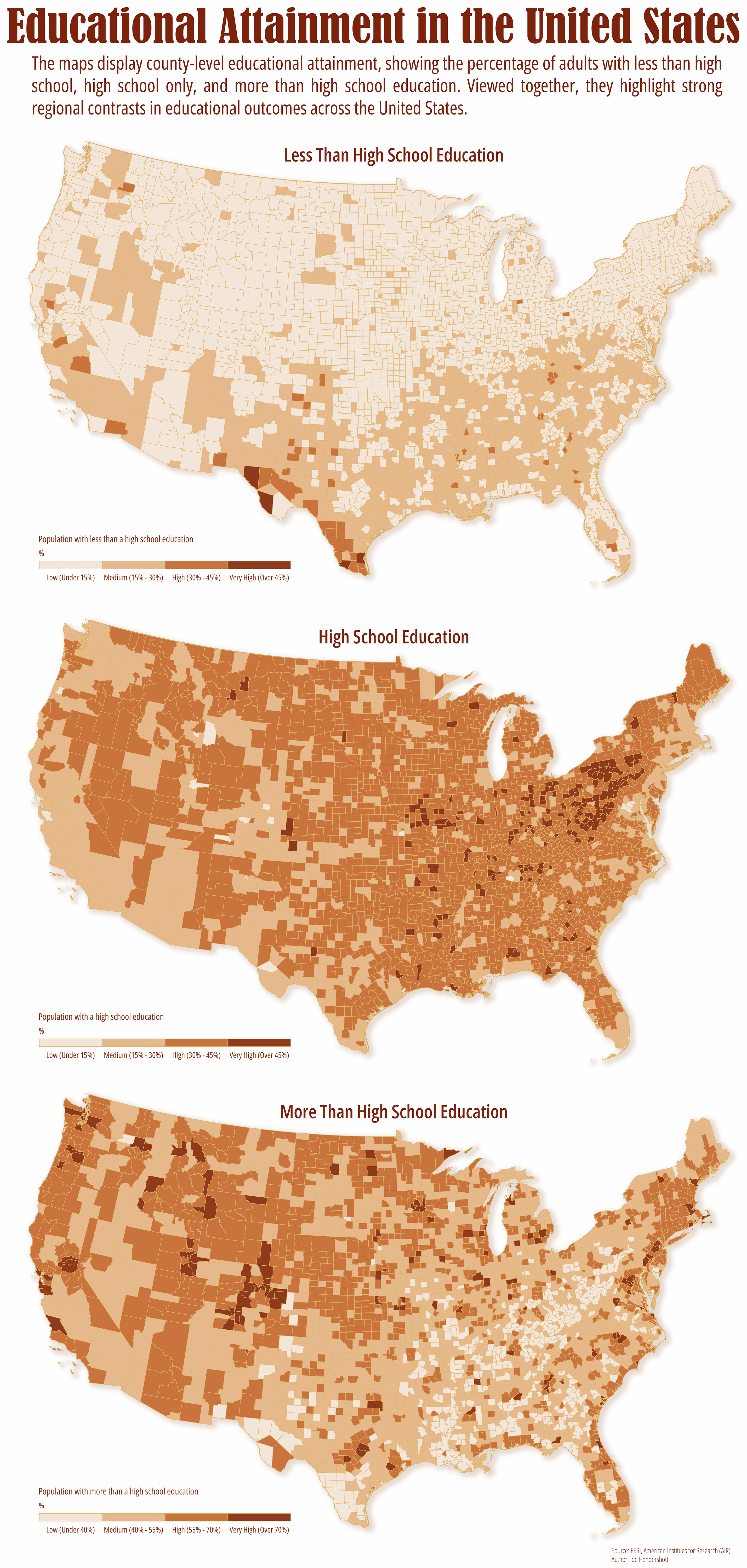
Educational attainment remains one of the strongest predictors of economic opportunity, health outcomes, and long-term regional growth. These maps, based on data from the American Institutes for Research, visualize county level patterns in educational attainment across the United States by separating adults into three groups: those with less than a high school diploma, those whose highest credential is high school, and those with education beyond high school, including college and graduate degrees.
Viewed side by side, the maps reveal how unevenly education is distributed across space. Areas with high concentrations of adults lacking a high school diploma remain clustered in parts of the South, Southwest, and rural regions, while counties with higher levels of post-secondary education are more common around major metropolitan areas, university hubs, and knowledge-based economies. The “high school only” map fills the middle ground, reflecting regions where access to post-secondary education or local labor market incentives may be more limited.
Rather than telling a single story, these maps underscore how education reflects broader structural forces, including historical investment, industrial change, access to institutions, and policy decisions. Mapping educational attainment spatially helps move the conversation beyond national averages and toward a clearer understanding of where opportunity is expanding, where it is constrained, and why place still matters.
Geography Joe January 12 2026Cartography, Analysis
Urban Hierarchy of Ukraine
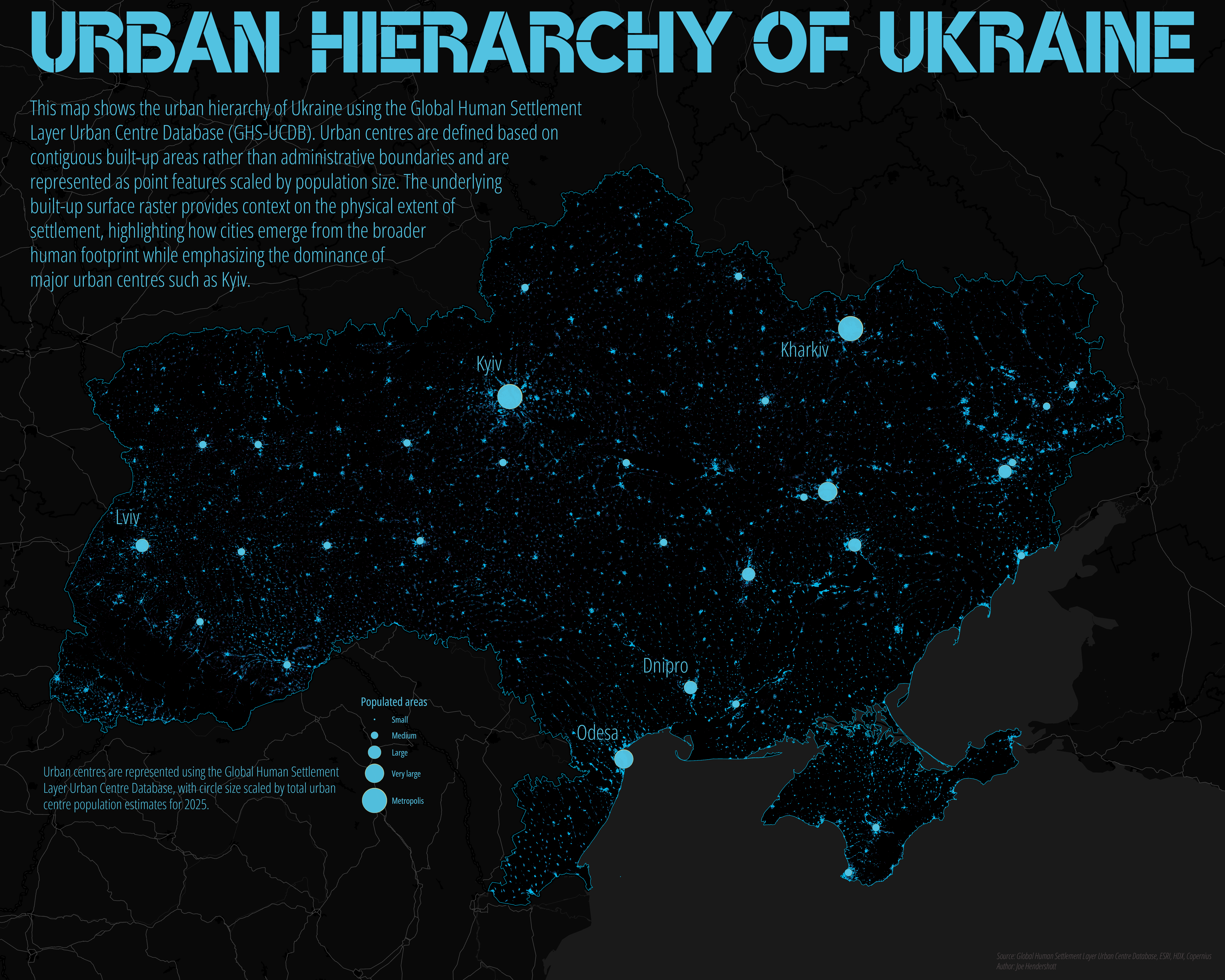
This map illustrates the urban hierarchy of Ukraine using the Global Human Settlement Layer Urban Centre Database (GHS-UCDB). Urban centres are represented as point features scaled by total estimated population for 2025, highlighting the relative dominance of major cities within the national urban system. Unlike administrative city boundaries, GHS-UCDB defines urban centres based on contiguous built-up areas detected from satellite imagery, allowing cities to be compared consistently regardless of municipal definitions or political borders. The resulting pattern emphasizes the primacy of Kyiv while also revealing secondary and regional centres such as Kharkiv, Odesa, Dnipro, and Lviv.
The underlying basemap uses the GHSL built-up surface raster, which depicts the physical footprint of human settlement rather than population density or land use classifications. This contextual layer shows how urban centres emerge from a dense but uneven settlement fabric, ranging from compact metropolitan cores to smaller regional cities embedded within widespread rural development. Together, the centroids and built-up texture provide a structural view of Ukraine’s urban system, focusing on scale and spatial organization rather than intra-urban variation. This approach supports comparative urban analysis and avoids implying precision or governance boundaries where none exist, making it well suited for regional planning, urban studies, and portfolio-level cartographic work.
Geography Joe January 12 2026Cartography, Analysis, Health
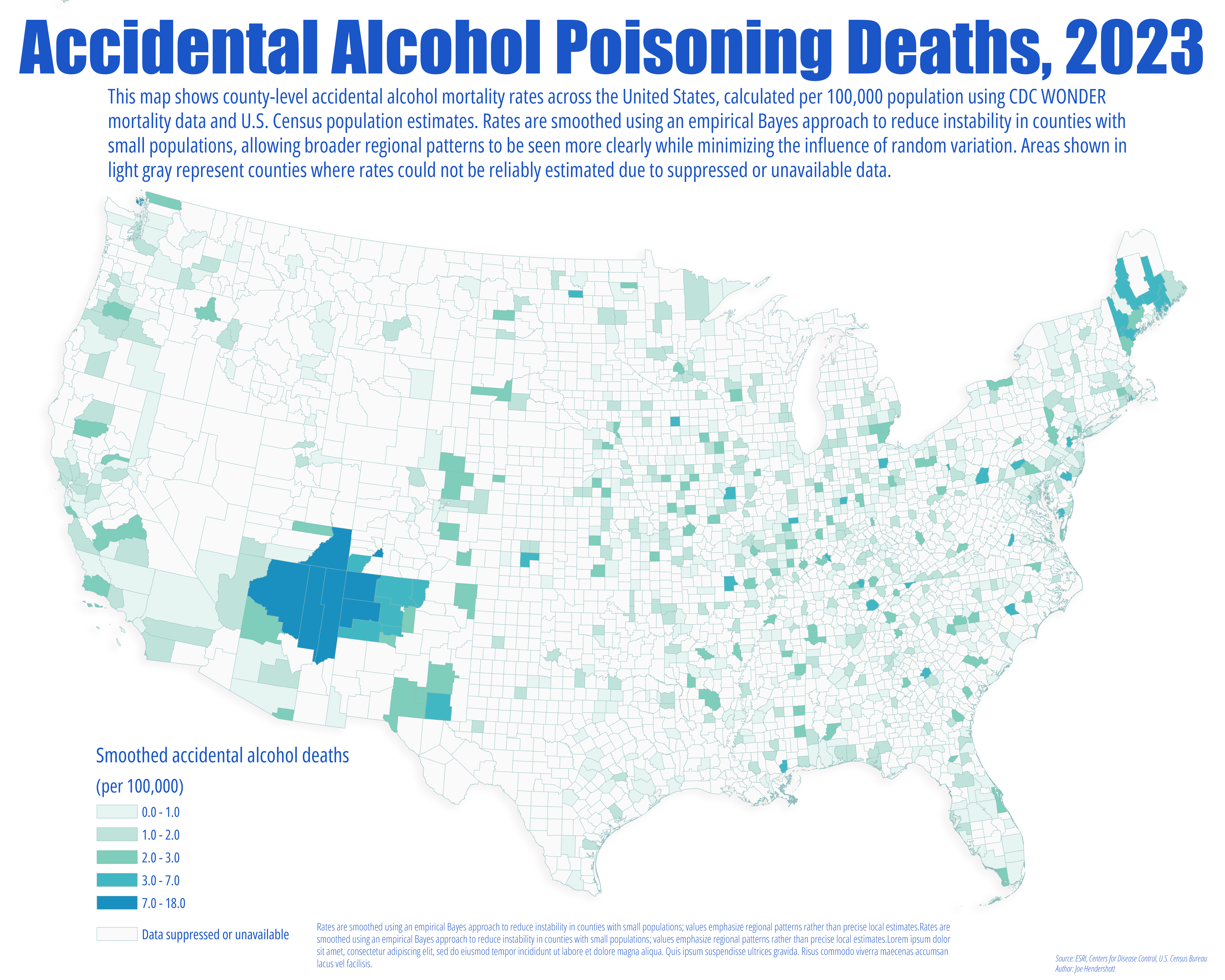
Accidental Alcohol Deaths in the United States
Geography Joe January 12 2026Cartography, Analysis, Public Health
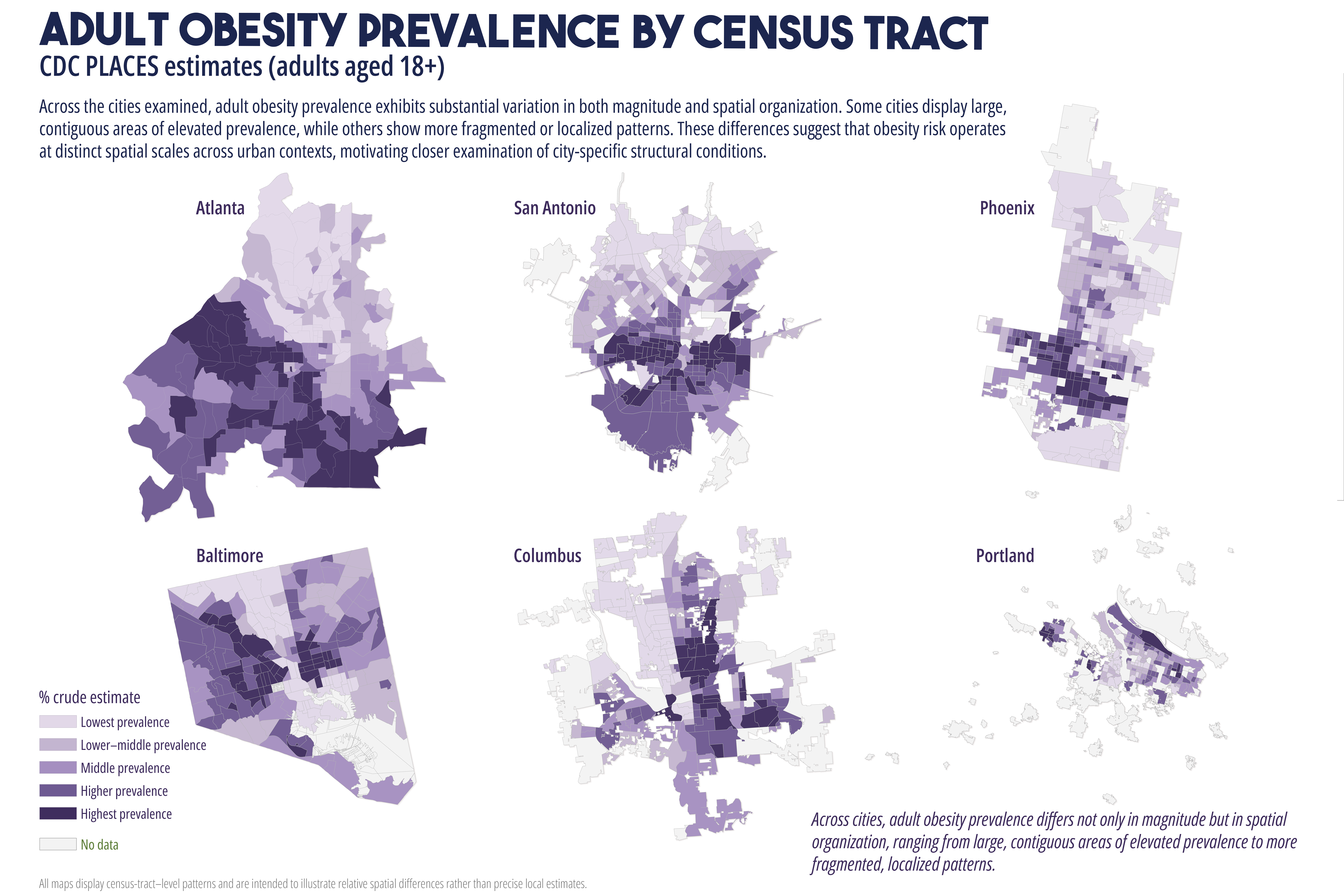
Comparative Urban Patterns of Cardiometabolic Health and Structural Context
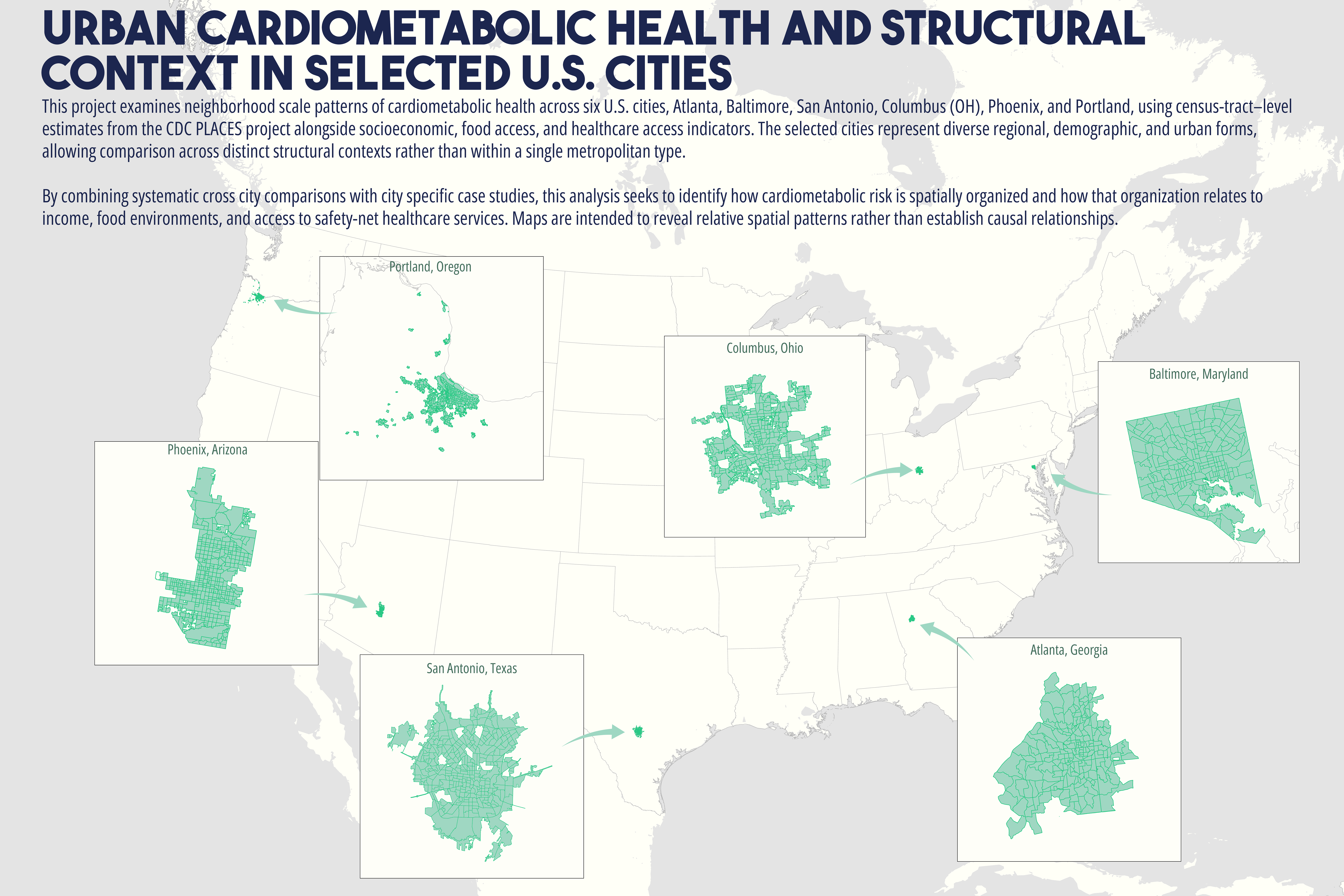
Oftentimes, I hear talk about health disparities as an access problem, more clinics, better food access, and shorter travel distances. But maps tell a more complicated story.
Looking across six U.S. cities, this project maps neighborhood-level cardiometabolic health alongside income, food environments, and healthcare access. In many cases, high disease burden persists even where services are nearby, suggesting that health outcomes are shaped by broader structural and environmental conditions.
If we want healthier cities, we need to design interventions that reflect how people actually experience place, not just where services are located.
Geography Joe December 31 2025Cartography, Analysis, Health
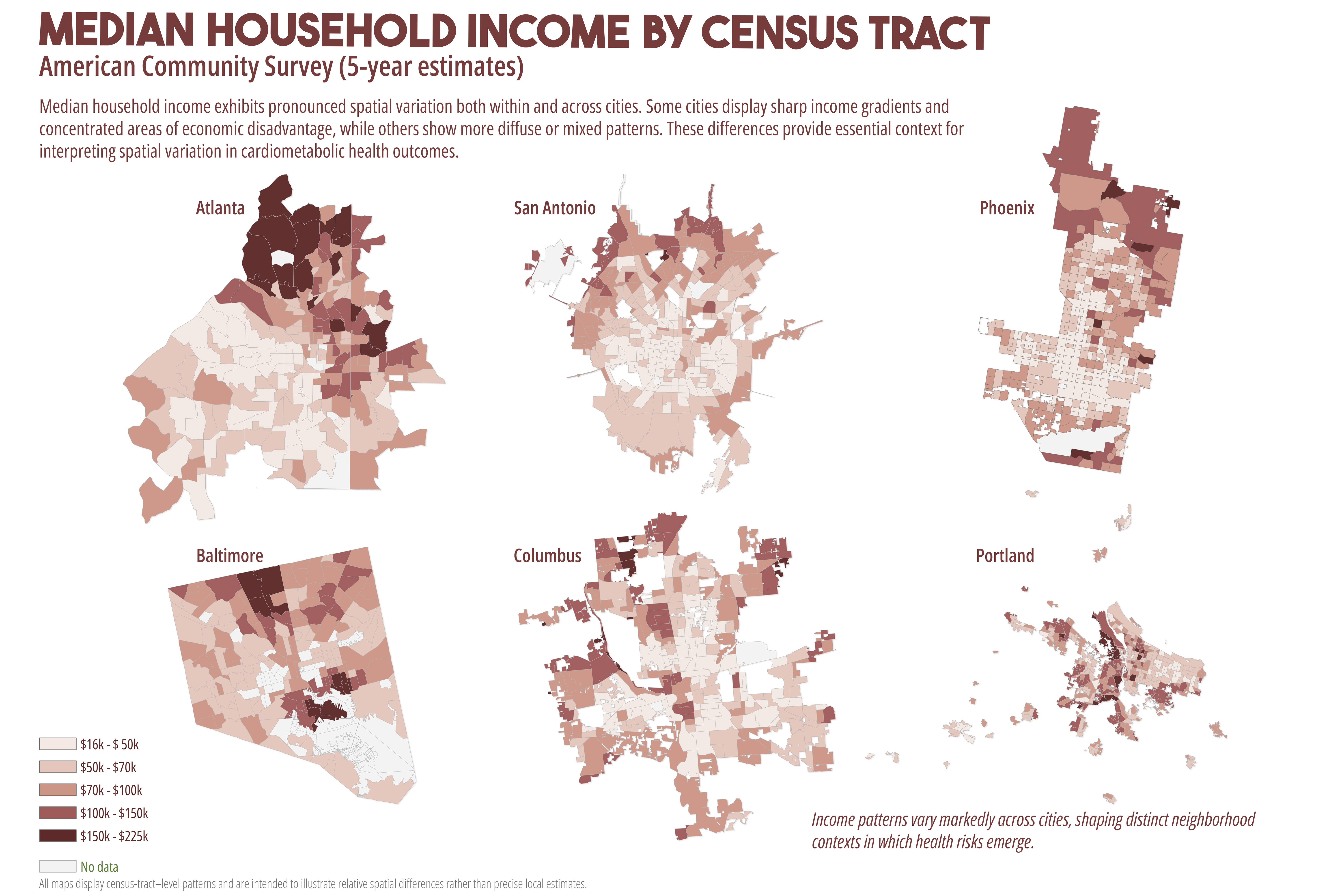
Spatial Patterns of Health, Income, and Access Across Atlanta
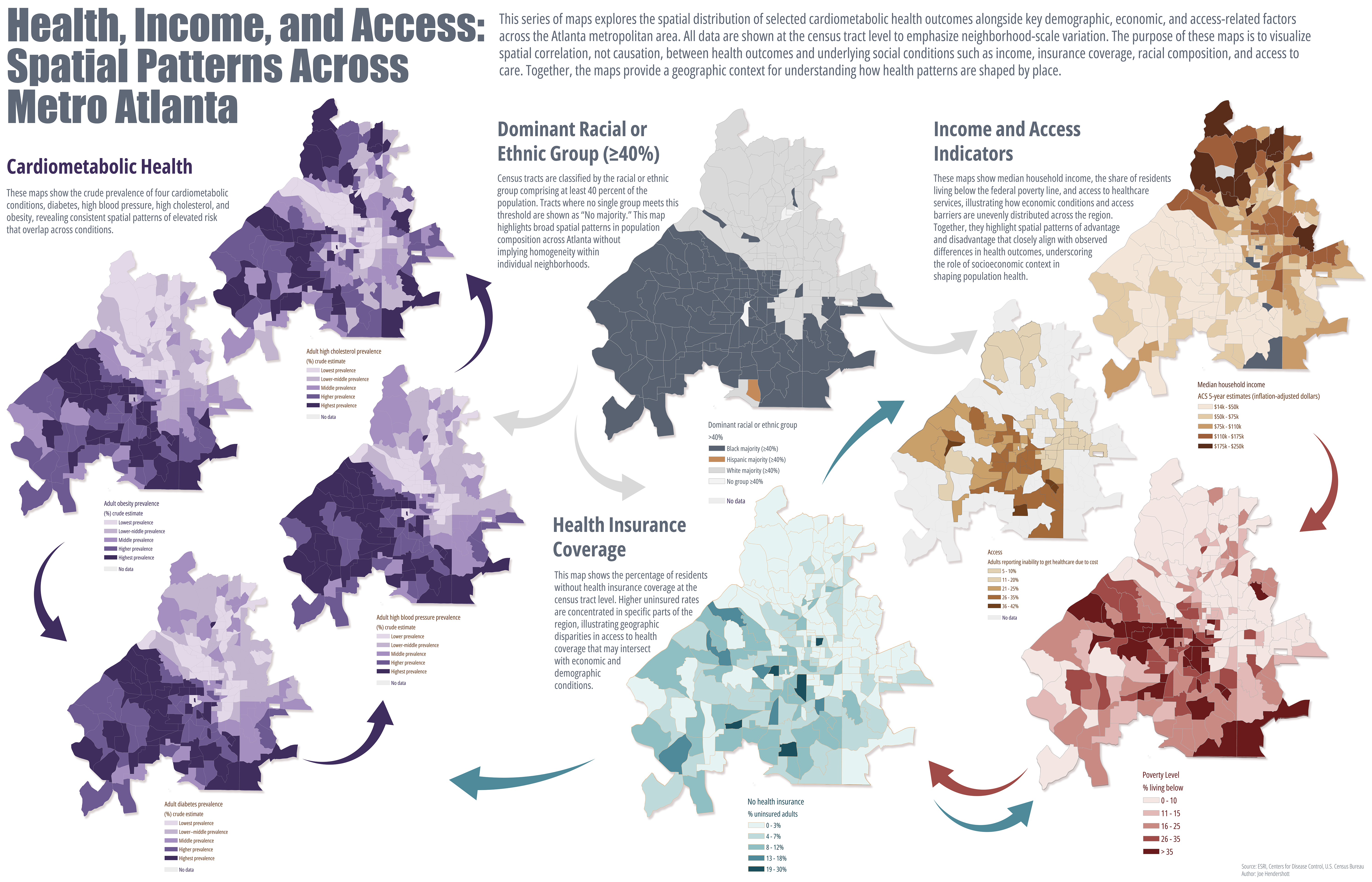
This project examines how cardiometabolic health outcomes intersect with race, income, poverty, and healthcare access across Metro Atlanta. By mapping these factors at the census tract level, the analysis highlights spatial patterns that are often obscured in tabular data, offering a place-based perspective that is directly relevant to public health practice, urban planning, and policy development. The intent is not to establish causality, but to visualize structural relationships that can inform targeted, equitable interventions.
Health outcomes were derived from the CDC PLACES dataset, which provides tract-level modeled estimates for chronic disease prevalence and risk factors. Socioeconomic, demographic, poverty, and health insurance indicators were drawn from the American Community Survey (ACS) 5-year estimates and related federal datasets. All datasets were standardized to census tracts and mapped using consistent geographic extents and classification methods to support cross-map comparison and interpretation.
Key limitations should be acknowledged. PLACES estimates are modeled and rely on survey inputs rather than clinical records, while ACS data are multi-year averages with associated margins of error, particularly at small geographic scales. Census tracts also vary in population size and internal heterogeneity. As such, these maps depict spatial correlation, not causal relationships, and should be interpreted as screening tools rather than diagnostic measures.
This matters because place-based disparities shape demand on healthcare systems, influence workforce participation, and affect long-term community resilience. Visualizing these relationships supports more strategic allocation of resources, informs prevention focused planning, and reinforces the importance of integrating health considerations into housing, transportation, and economic policy decisions.
Geography Joe December 31 2025Cartography, Analysis, Health
Suicide Rates in the United States
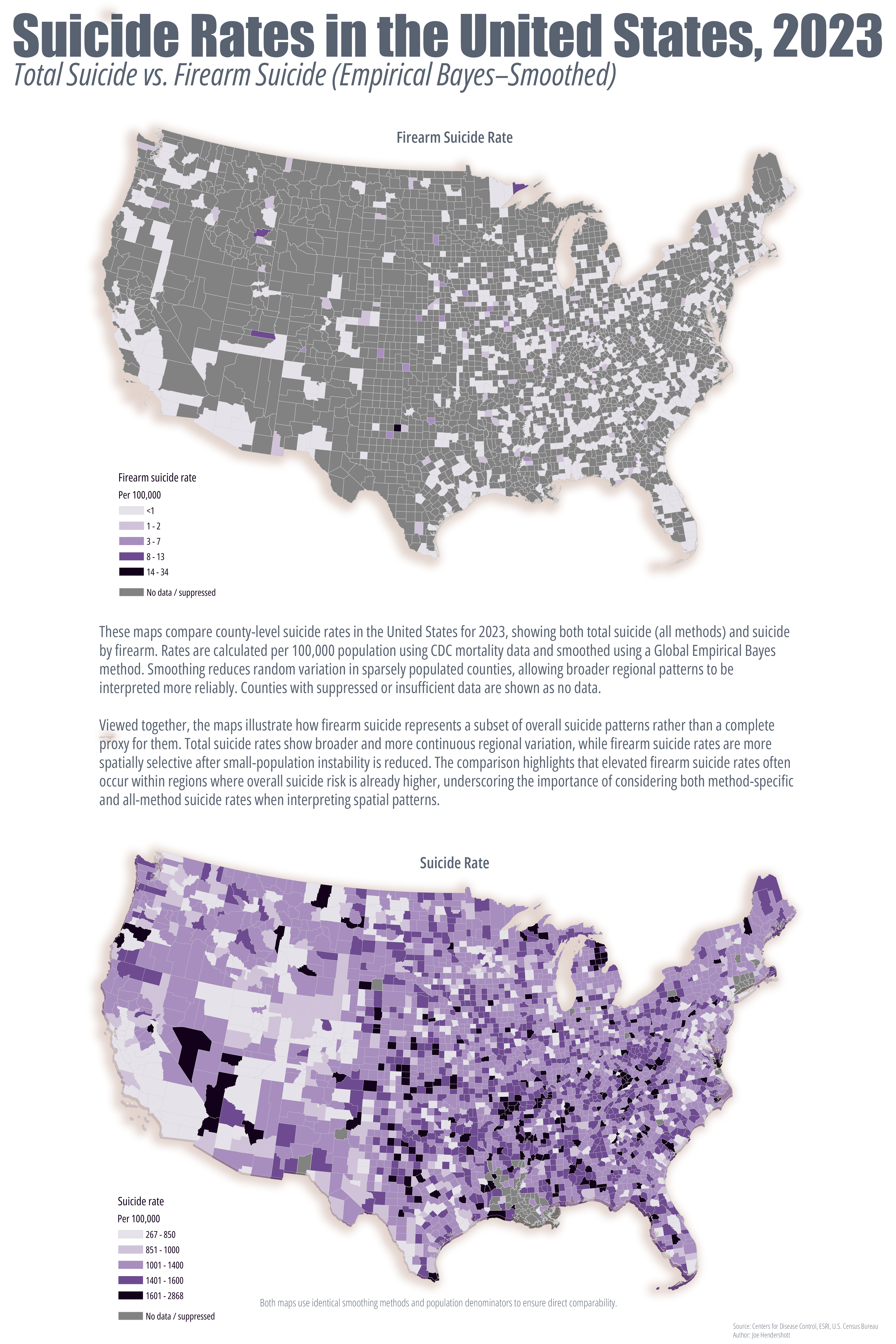
These maps present a county-level comparison of total suicide rates (all methods) and suicide by firearm in the United States using 2023 mortality data from the Centers for Disease Control and Prevention (CDC) and population estimates from the U.S. Census. Rates are calculated per 100,000 population to allow meaningful comparison across counties with widely varying population sizes. To reduce random variation associated with small populations and low event counts, both maps use a Global Empirical Bayes smoothing approach, which stabilizes rate estimates while preserving broader regional patterns. Counties with suppressed or unreliable CDC data are shown as no data and were excluded from calculations to avoid misrepresentation.
Viewed together, the maps highlight important differences between overall suicide risk and method-specific patterns. Total suicide rates show broader and more continuous regional variation, reflecting underlying social, economic, and environmental factors that influence suicide risk across large areas. In contrast, firearm suicide rates represent a subset of this broader pattern and become more spatially selective once small-population instability is reduced. The comparison demonstrates that firearm suicide rates often align with regions of elevated overall suicide risk, but do not fully replicate the total suicide geography, underscoring the importance of examining both all-method and method-specific data when interpreting spatial patterns.
As with all small-area mortality mapping, these rates should be interpreted cautiously. Even with statistical smoothing, county-level estimates are best understood as indicators of broader regional trends rather than precise local measurements.
Geography Joe December 22 2025Cartography, Analysis, Crime
Neighborhood Crime in Atlanta
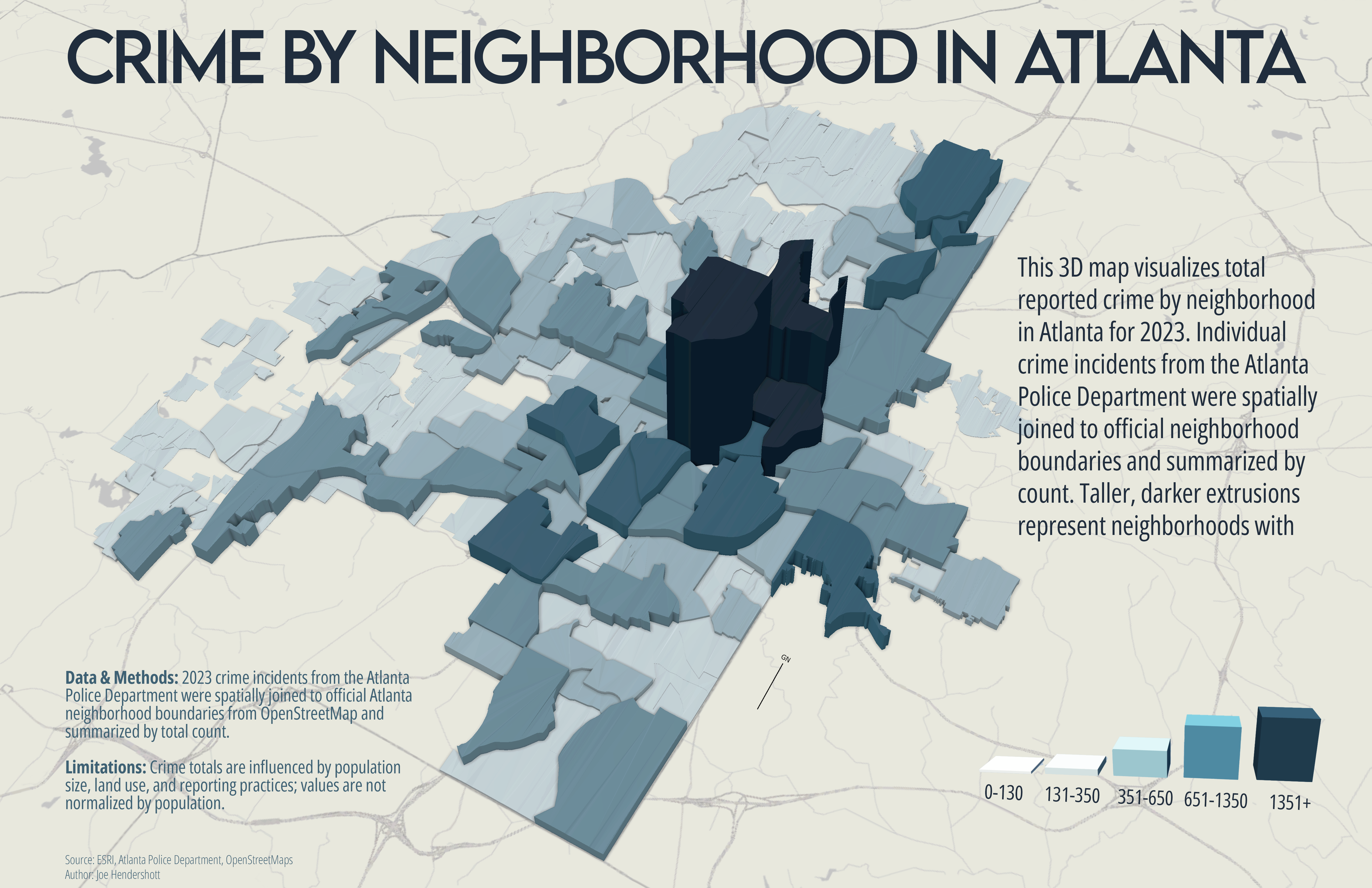
This map explores the spatial distribution of reported crime across Atlanta neighborhoods during 2023. Crime incident data were obtained from the Atlanta Police Department and include all reported offenses for the calendar year. To understand how crime varies across the city at a neighborhood scale, individual incidents were aggregated using officially recognized neighborhood boundaries derived from OpenStreetMap.
Each neighborhood is represented as a three-dimensional extrusion, where both height and color indicate the total number of reported crimes. Taller and darker blocks correspond to higher crime totals, while shorter and lighter blocks indicate lower totals. Using 3D extrusions allows relative differences between neighborhoods to be read quickly, while still preserving the underlying geographic context of the city.
The map is intended to support visual comparison rather than precise measurement. Differences in neighborhood size, land use, population, and reporting practices all influence crime totals and should be considered when interpreting the results. High values do not necessarily imply higher risk for individuals, but instead reflect the concentration of reported incidents within a given neighborhood boundary.
This visualization is best read as a citywide overview that highlights spatial patterns and contrasts, rather than a definitive ranking of neighborhood safety.
Geography Joe December 22 2025Cartography, Analysis, Health
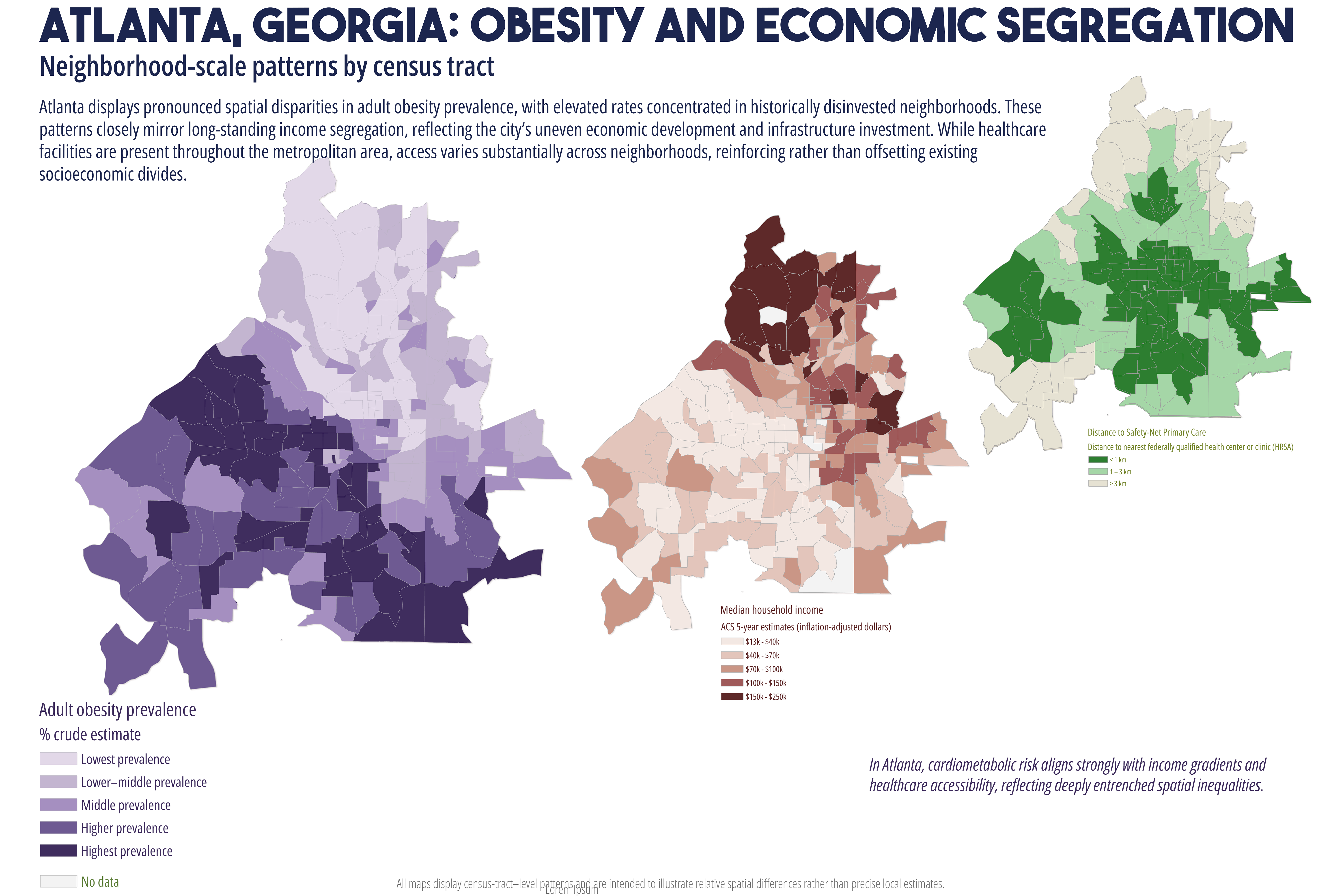
Neighborhood Patterns of Cardiometabolic Health in Atlanta
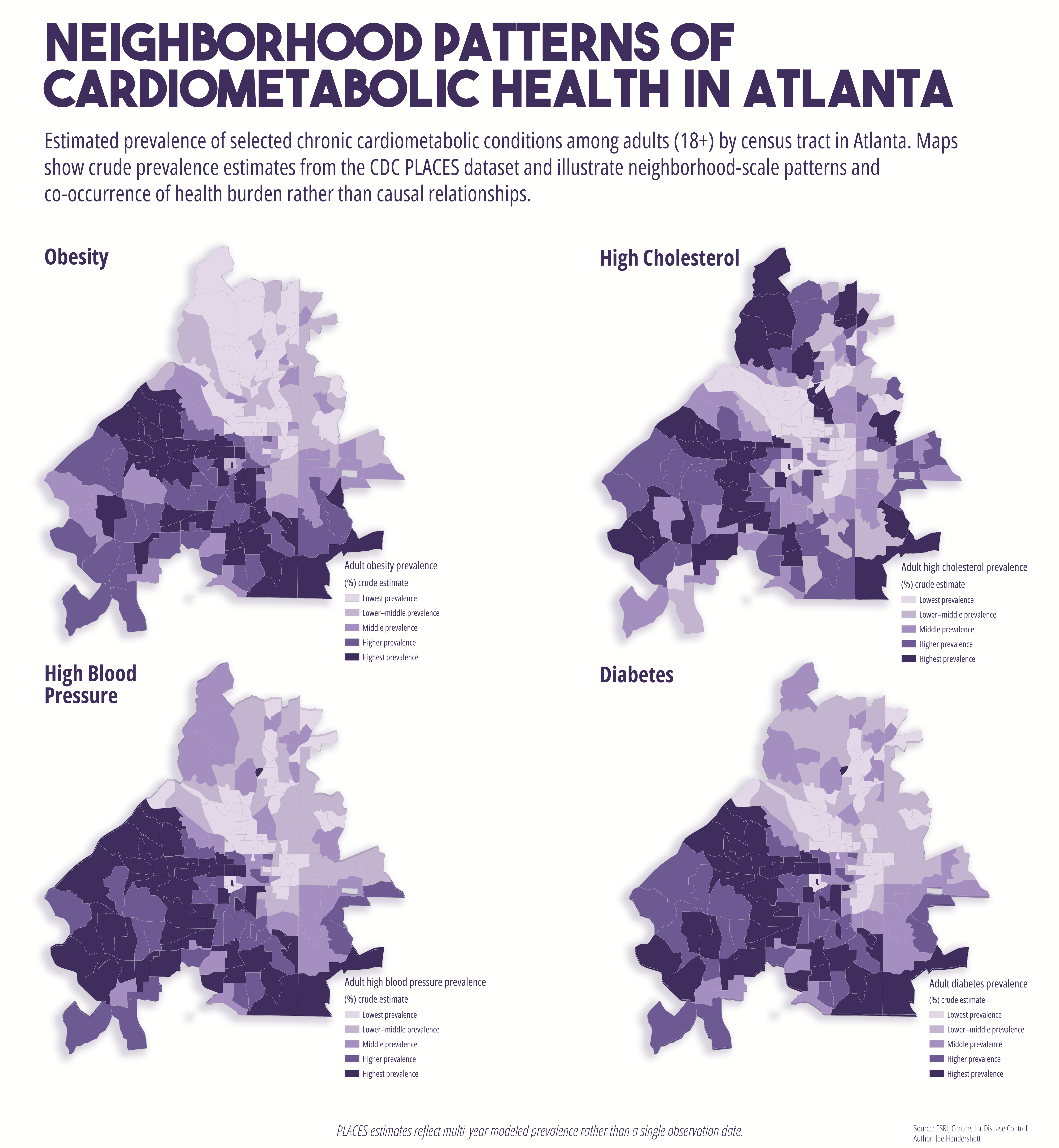
I thought focusing on health in and around Atlanta is an important topic for us all- and those New Year's resolutions!
These maps use the CDC’s PLACES dataset, which provides census tract level estimates of selected adult health outcomes derived from the Behavioral Risk Factor Surveillance System (BRFSS) using small area estimation techniques. Census tracts within the City of Atlanta were used as the unit of analysis to capture neighborhood scale variation that is not visible in county level data. PLACES estimates are model-based and reflect multi-year prevalence patterns associated with the dataset’s release period rather than a single observation year.
Four related cardiometabolic health outcomes were mapped: diabetes, high blood pressure, high cholesterol, and obesity. All maps display crude prevalence estimates, representing the modeled percentage of adults (18+) in each tract with a given condition. Crude prevalence was used intentionally to reflect the lived burden of chronic disease within neighborhoods rather than standardizing populations for epidemiological comparison.
To support direct comparison, all four maps share the same geographic extent, census tract boundaries, classification method, and color scheme. Health outcomes were classified using quantiles, and a single muted sequential color ramp was applied consistently, with darker shades indicating higher estimated prevalence. Basemap layers were removed to reduce visual clutter and create space for interpretive text. Viewed together, the maps highlight the spatial co-occurrence of multiple chronic health conditions across Atlanta neighborhoods. The intent is to illustrate neighborhood scale patterns and associations rather than imply causal relationships. Because PLACES estimates incorporate demographic and socioeconomic information, observed alignments with income, race, or other contextual variables should be interpreted as spatial patterns within broader structural conditions.
Geography Joe December 20 2025Cartography, Analysis
Spatial Distribution of Crime Near MARTA Rail Staions
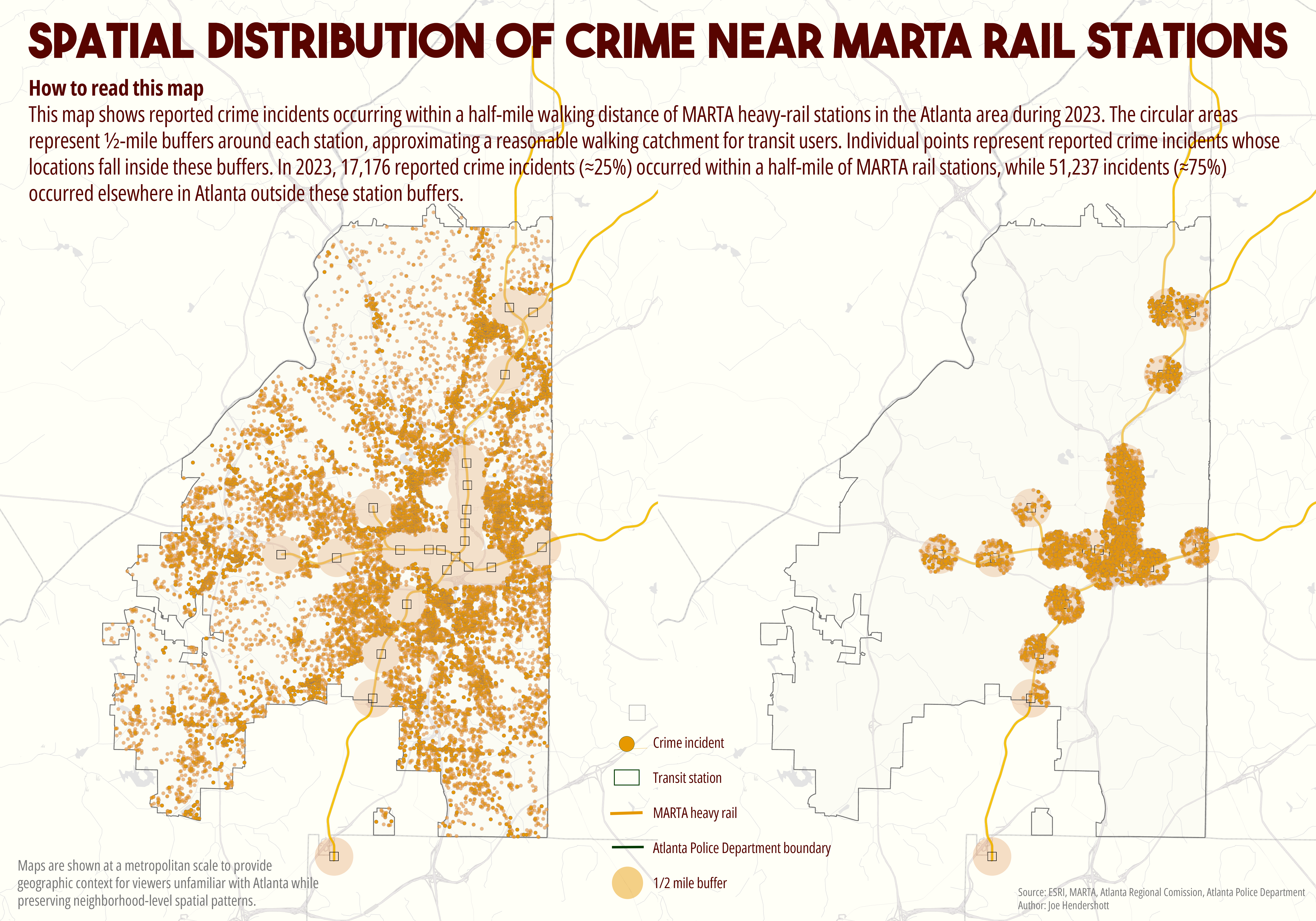
I often hear the same excuse when asking why MARTA ridership is so low: It's too unsafe. So I got to thinking how I might map data so that most normal people might understand, while still keeping it accurate and objective. This is what I came up with.
Crime incident data for 2023 were obtained for the City of Atlanta and cleaned to ensure each record represented a single reported incident with a valid location. MARTA rail station locations were obtained as point data and filtered to include only stations within the City of Atlanta.
All spatial analysis was conducted in ArcGIS Pro.
MARTA rail stations were filtered to include Atlanta-served stations only, excluding stations outside city jurisdiction.
Stations were retained as point features for buffer generation.
Two buffer distances were tested:
¼ mile buffer (approximate 5-minute walk)
½ mile buffer (approximate extended walking catchment)
Buffers were generated using:
Buffer (Analysis Tools)
Dissolve type: None (initially)
To prevent double-counting crime incidents near stations with overlapping service areas (especially downtown), buffers were:
Dissolved into a single multipart polygon. This created one unified “MARTA influence area” per buffer distance Atlanta-wide crime incidents were split into two mutually exclusive groups:
A. Crime Inside MARTA Buffer
Clip tool was used to extract crime incidents that fall within the dissolved MARTA buffer with the result of a point layer representing crimes near rail stations
B. Crime Outside MARTA Buffer
Erase tool was used to remove buffered areas from the Atlanta crime layer
Result: point layer representing crimes elsewhere in the city.
Together, these two layers account for all reported crime incidents in Atlanta, without overlap.
Incident totals were obtained directly from the attribute tables:
Each row represents one reported incident
Counts were verified after spatial operations
For map presentation:
Crime points were symbolized with small, semi-transparent markers while
buffers were shown with muted fill colors and low opacity. Basemap contrast was reduced to emphasize spatial patterns rather than individual streets.
This analysis examined the spatial relationship between reported crime incidents in Atlanta and proximity to MARTA rail stations. By dividing crime incidents into those occurring within walking distance of rail stations and those occurring elsewhere in the city, I believe the analysis provides a clear, geography-based comparison without assuming causality.
Geography Joe December 13 2025Cartography, Analysis
Change in the Percentage of People With a College Degree in Atlanta
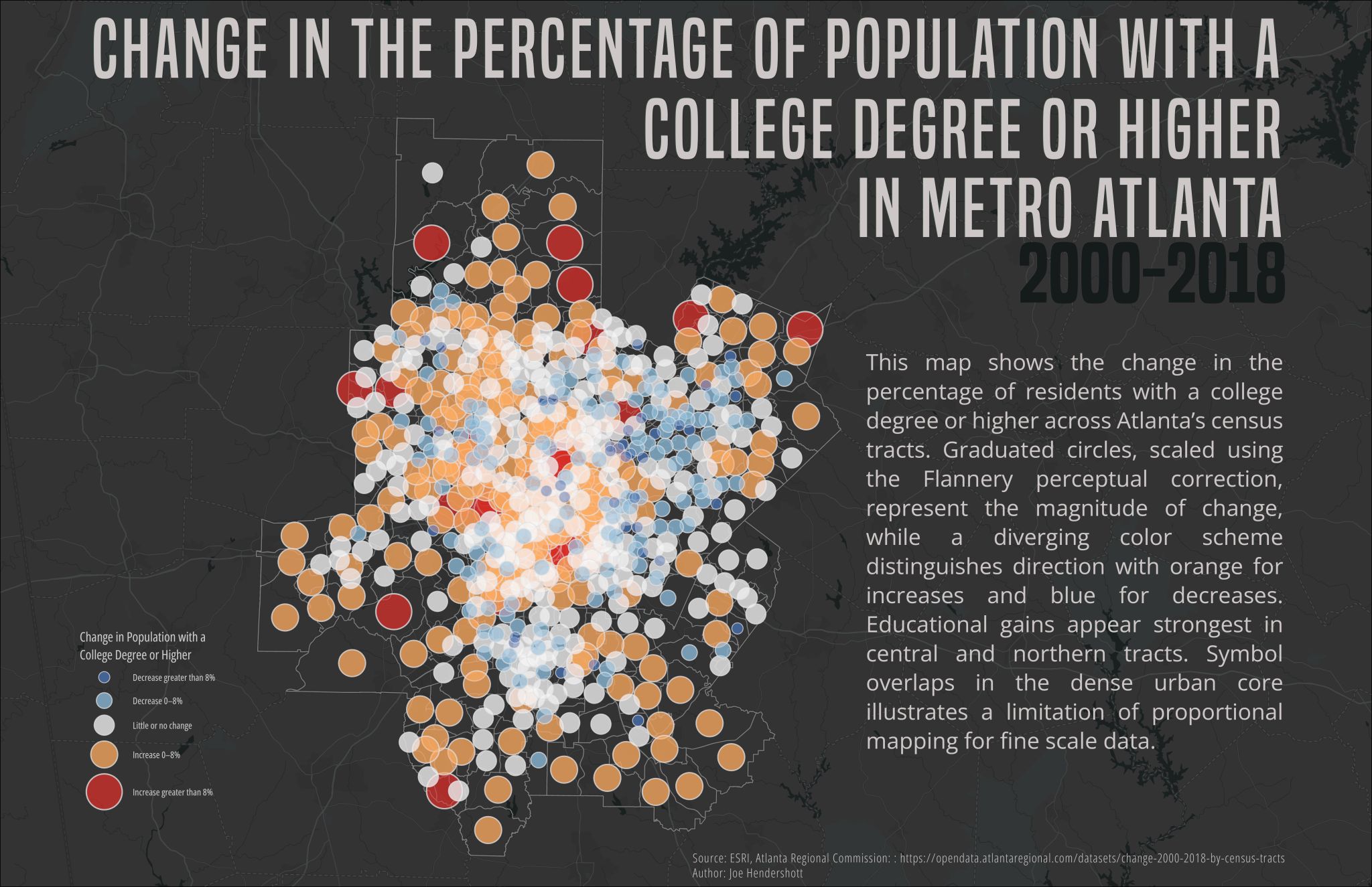
This map shows how the share of residents with a college degree or higher changed across Metro Atlanta census tracts between 2000 and 2018. Each circle represents a census tract and is sized based on the magnitude of change, so larger circles indicate bigger shifts over time. Color shows the direction of change: warm colors represent increases in educational attainment, while cool colors indicate decreases, and neutral tones show little or no change. Using circles instead of shaded areas allows both the size and direction of change to be shown at the same time across the region.
The map reveals strong spatial differences in educational change across Metro Atlanta. Increases in college-educated populations are most pronounced in central and northern parts of the region, particularly in areas that have experienced redevelopment and population growth. In contrast, some southern and outer tracts show smaller gains or declines, suggesting uneven access to educational and economic opportunity. Together, these patterns highlight how educational attainment has become increasingly concentrated in certain neighborhoods, reinforcing broader trends of inequality and segregation within the metropolitan area.
Geography Joe December 13 2025Cartography, Analysis
Global Carbon Emissions by Country
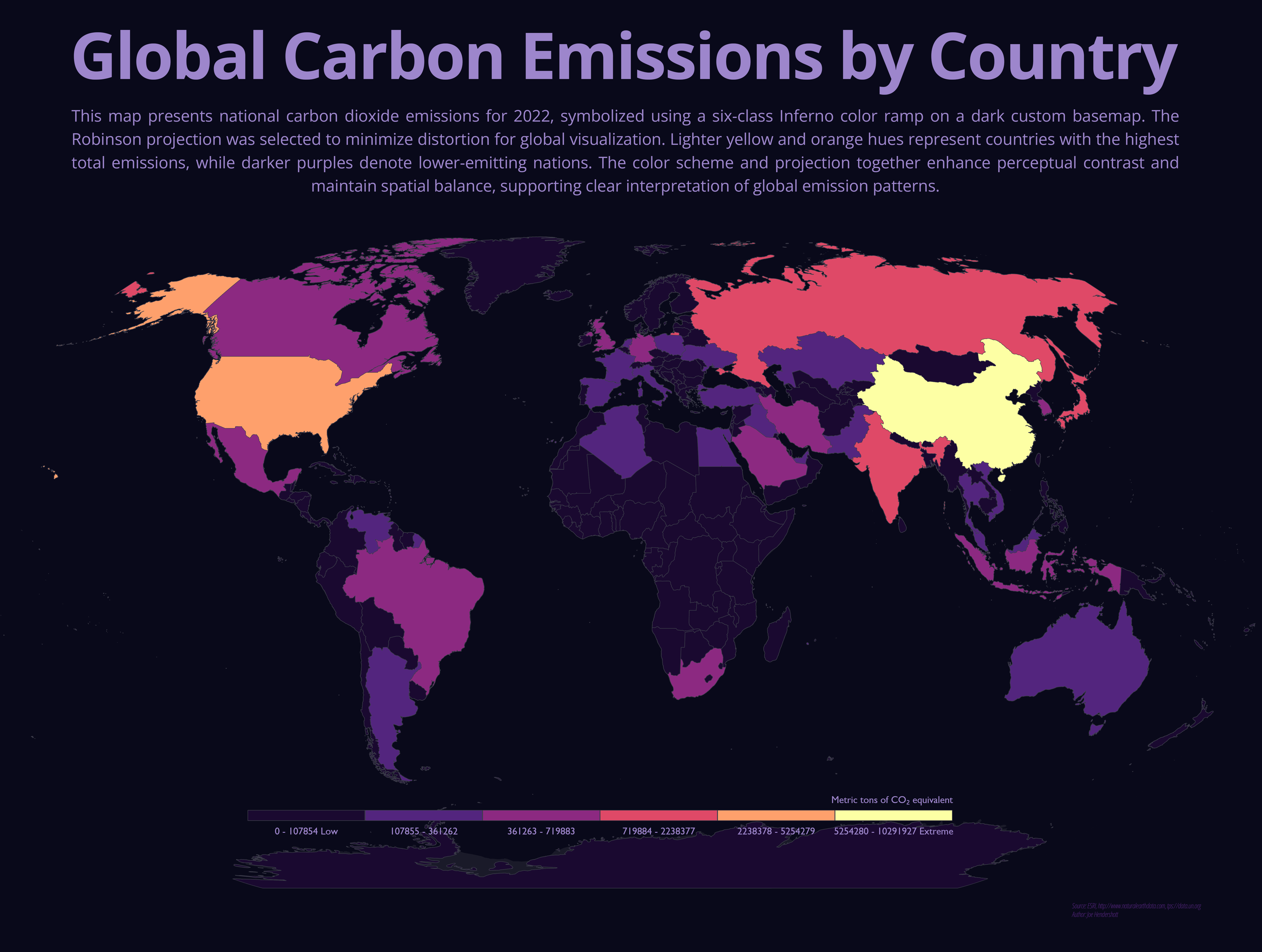
This map shows total national carbon dioxide emissions for countries around the world in 2022. Each country is shaded using a graduated color scale, where darker purples represent lower emissions and lighter yellow-orange tones indicate higher emissions. A global map projection was used to present the world in a balanced way, helping preserve the relative size and position of countries for comparison. The dark background and high-contrast color scheme make differences between countries easier to see, especially when viewing global patterns rather than local detail.
The map highlights how global carbon emissions are concentrated in a relatively small number of countries. China and the United States stand out as the largest emitters, followed by other highly industrialized or rapidly developing nations such as India and Russia. Much of Africa, South America, and smaller nations show lower total emissions, reflecting lower levels of industrial activity and energy consumption. These patterns illustrate the uneven global contribution to climate change and help explain why international climate policy often focuses on cooperation between major emitting countries, even though climate impacts are felt worldwide.
Geography Joe December 13 2025
Satilla River Watershed Fact Sheet
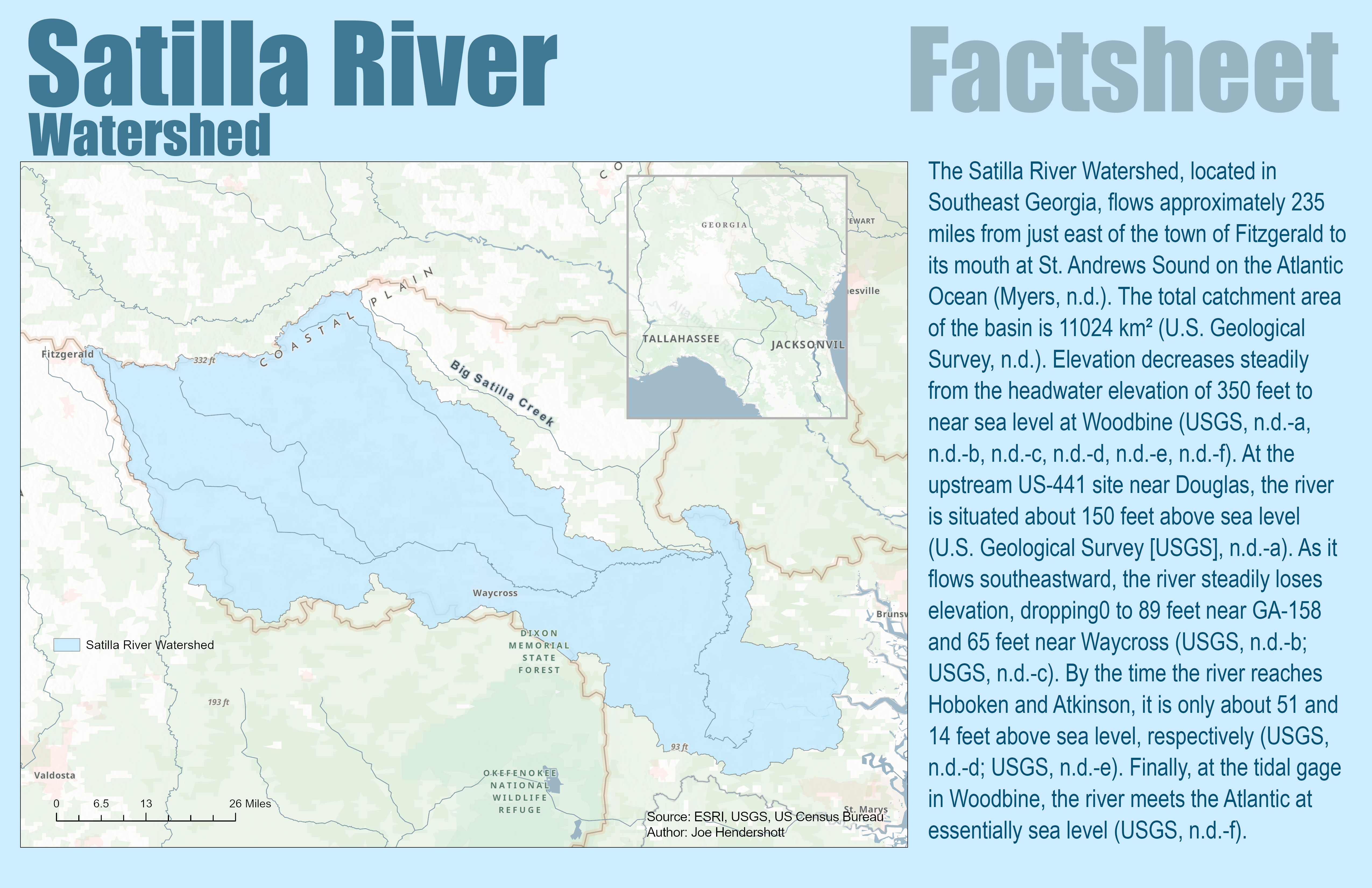
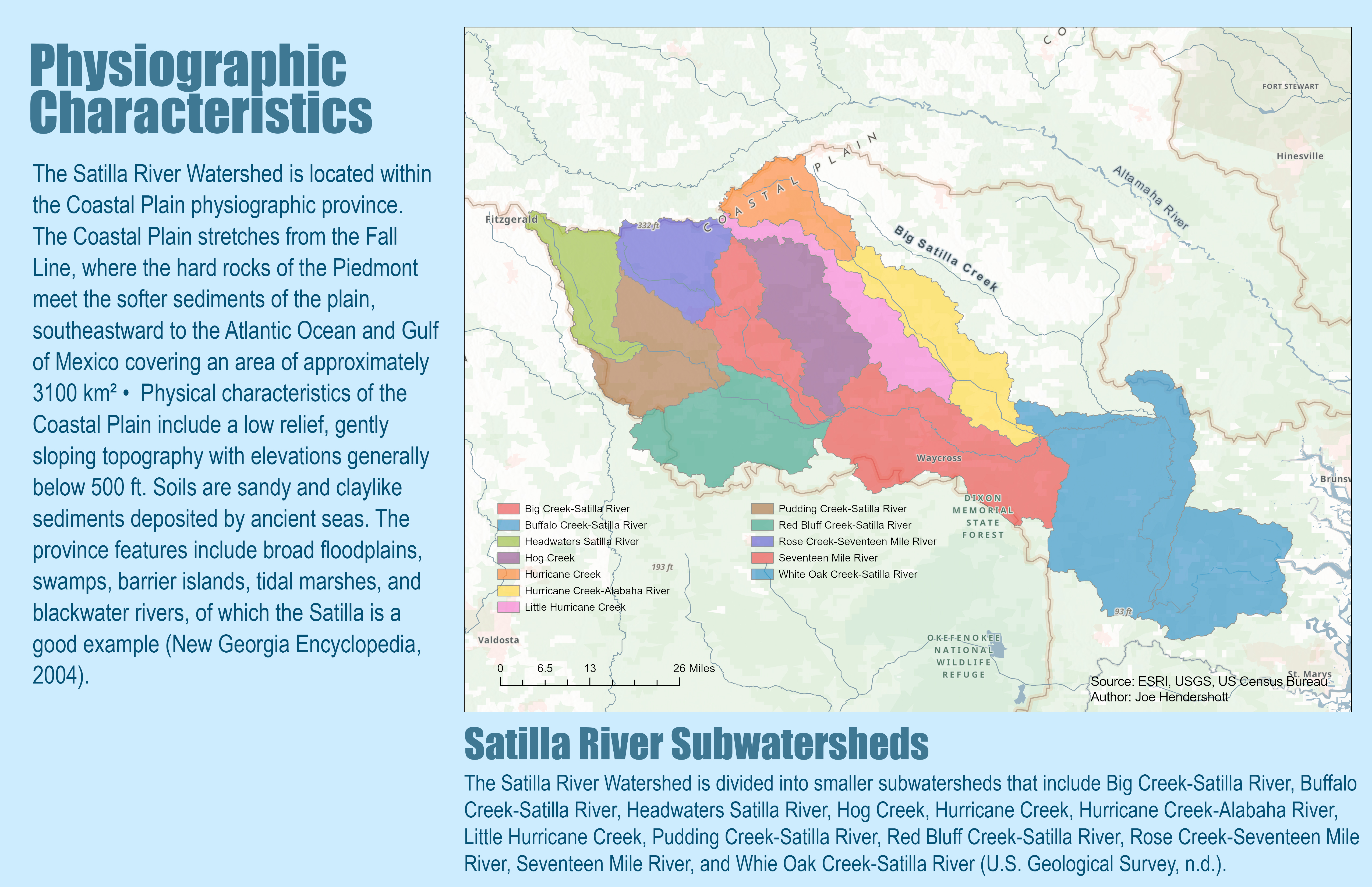
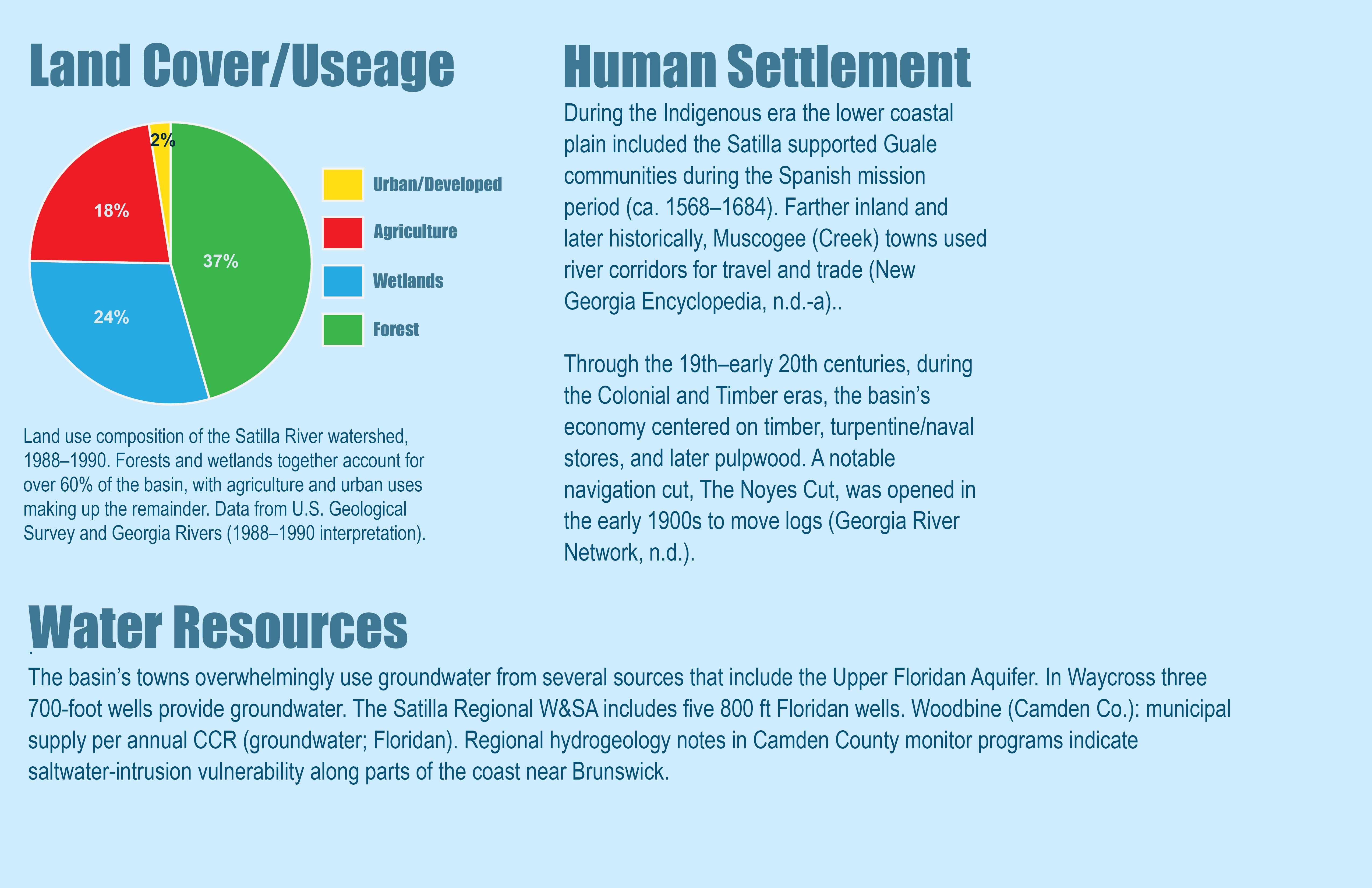
This factsheet provides an overview of the Satilla River Watershed in southeast Georgia, tracing the river from its headwaters near Fitzgerald to its mouth at St. Andrews Sound on the Atlantic coast. The Satilla River flows approximately 235 miles through a low-lying Coastal Plain landscape characterized by gentle slopes, sandy soils, wetlands, and broad floodplains. Maps and graphics show the watershed boundary, major subwatersheds, land cover, and key physical features, highlighting how elevation steadily decreases from inland areas to near sea level at the coast. Forests and wetlands dominate the basin, together making up more than 60 percent of land cover, while agriculture and limited urban development account for the remainder
The factsheet also explains how human activity and natural processes shape the Satilla River system today. Historically, the river supported Indigenous communities and later played a central role in timber, naval stores, and pulpwood industries. Today, most communities in the basin rely on groundwater from the Upper Floridan Aquifer, while land-use change, mineral extraction, and increasing development pose growing challenges. Pollution from both point sources, such as permitted discharges, and non-point sources, including agricultural runoff and septic systems, affects water quality in parts of the river. Several stream segments are impaired for bacteria, dissolved oxygen remains a concern in this blackwater system, and fish consumption advisories apply in some areas. Together, these factors highlight the Satilla River as a largely natural but vulnerable watershed where land use, water resources, and environmental health are closely interconnected
.
Geography Joe December 13 2025Cartography, Analysis
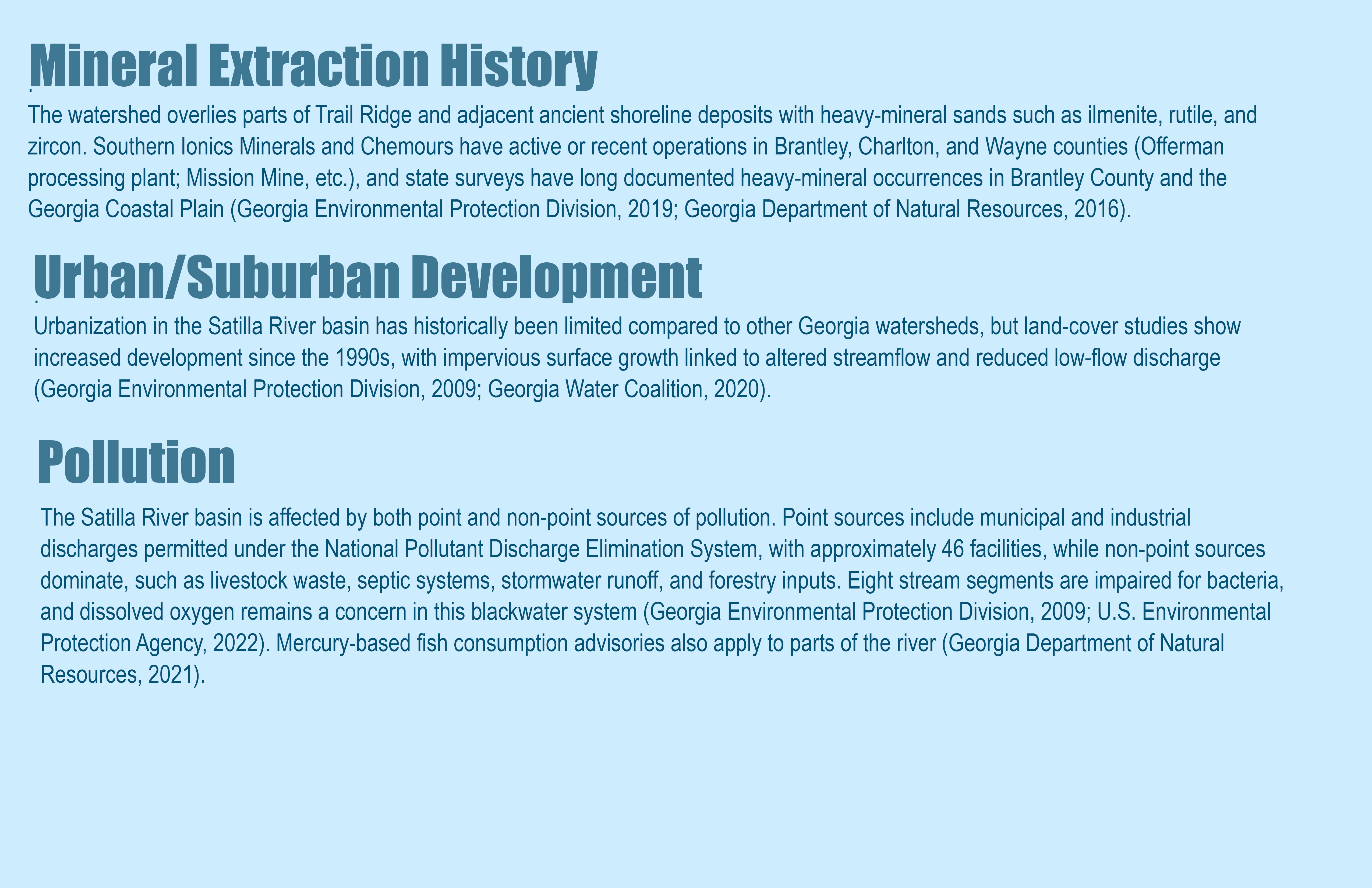
Atlanta Poverty Level Change
This map shows how poverty levels changed across Atlanta census tracts between 2000 and 2018. Each tract is colored based on the percentage increase or decrease in the share of residents living below the poverty line over that period. Green areas indicate places where poverty declined, while brown areas show where poverty increased, with darker shades representing larger changes. Census tracts with little or no measurable change are shown in white. Using census tracts allows for neighborhood-level comparisons while keeping the data consistent across time.
The map reveals uneven changes in poverty across Atlanta, highlighting growing spatial inequality within the city. Declines in poverty are concentrated in a small number of central and west-side neighborhoods that have experienced redevelopment and gentrification. In contrast, many southern and peripheral areas show rising poverty, suggesting that economic hardship has shifted outward rather than disappeared. Together, these patterns illustrate how neighborhood change in Atlanta has often involved displacement and redistribution of poverty, rather than broad-based economic improvement across the city.
Geography Joe December 13 2025Cartography, Analysis
Toatal Native American Population
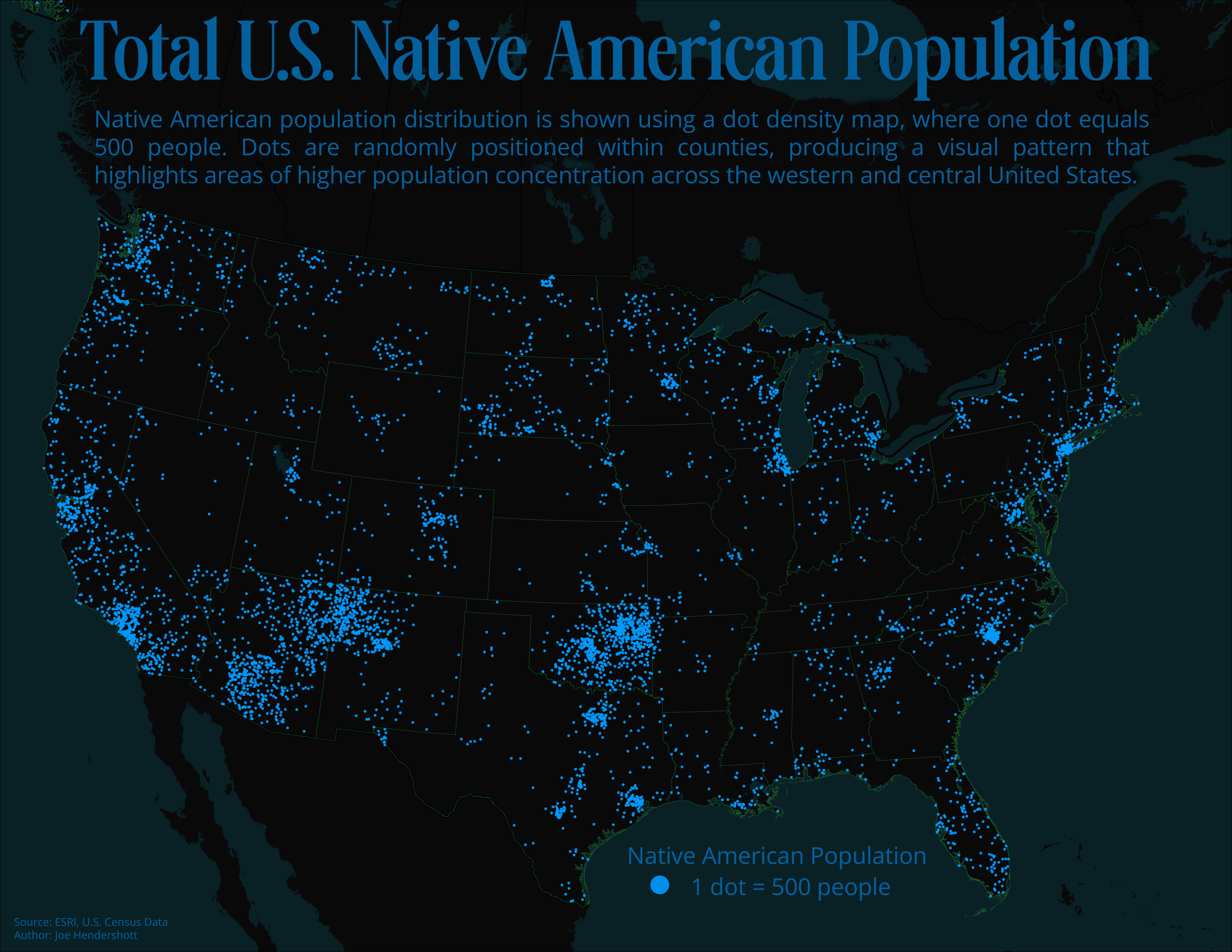
This map uses a dot density approach to show the distribution of the Native American population across the United States. Each dot represents 500 people and is randomly placed within county boundaries, so areas with more dots indicate higher populations rather than exact residential locations. By using dots instead of shading, the map emphasizes patterns of concentration and spread without relying on administrative averages that can hide local variation. The dark background helps the bright dots stand out, making population clusters easier to see at a national scale.
The map reveals that Native American populations are not evenly distributed across the country, but instead form distinct regional clusters. The highest concentrations appear in the Southwest, particularly in Arizona and New Mexico, as well as in parts of the Great Plains, Oklahoma, the Pacific Northwest, and Alaska. Smaller but still visible populations are spread throughout the Midwest, Southeast, and Northeast, reflecting both historic homelands and more recent migration patterns. Together, these patterns highlight the enduring geographic presence of Native American communities across the United States, while also showing how historical displacement, reservations, and urban migration have shaped today’s population landscape.
Geography Joe December 13 2025Cartography, Analysis
Racial Population Difference and Per Capita Income in Georgia
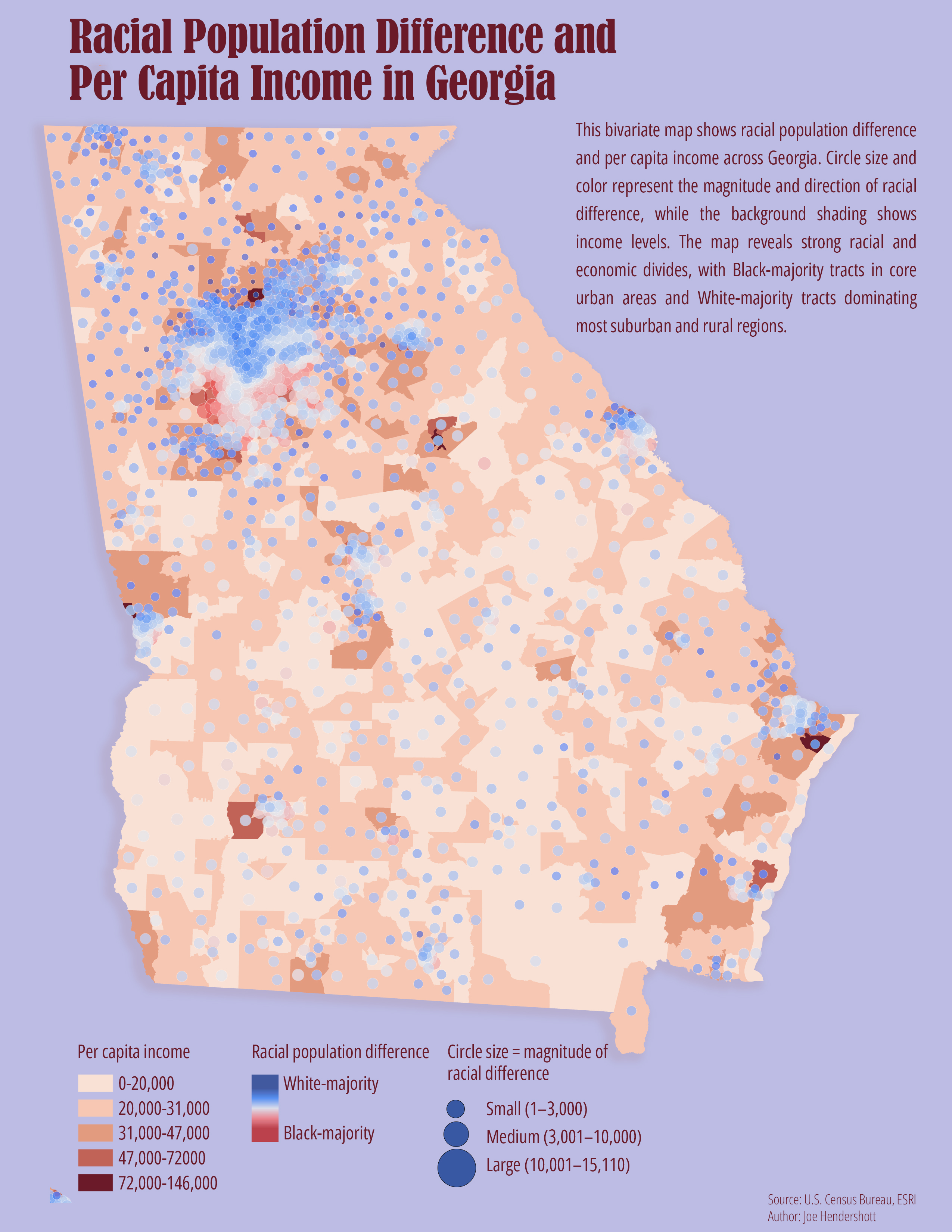
This map combines two different kinds of information to show how race and income vary across Georgia. The background shading represents per capita income by census tract, with darker colors indicating higher income levels. On top of this, circles show racial population differences within each tract. Blue circles indicate areas where White residents make up the majority, while red circles indicate Black-majority areas. The size of each circle reflects how large that population difference is, with larger circles showing places where one group significantly outnumbers the other. Using this layered approach allows the map to show not just where people live, but how racial composition and income patterns intersect across the state.
The map reveals clear and persistent racial and economic divides across Georgia. Black-majority tracts are heavily concentrated in the urban core of Atlanta and in parts of southern and coastal Georgia, while White-majority tracts dominate most suburban and rural areas. Higher-income areas tend to cluster in suburban regions and around select metropolitan corridors, while many Black-majority tracts coincide with lower income levels. Together, these patterns highlight how race and income are closely linked in Georgia’s geography, reflecting long-standing histories of segregation, disinvestment, and unequal access to economic opportunity that continue to shape where people live today.
Geography Joe December 13 2025Cartography, Humour
Everybody Was Kung Fu Fighting
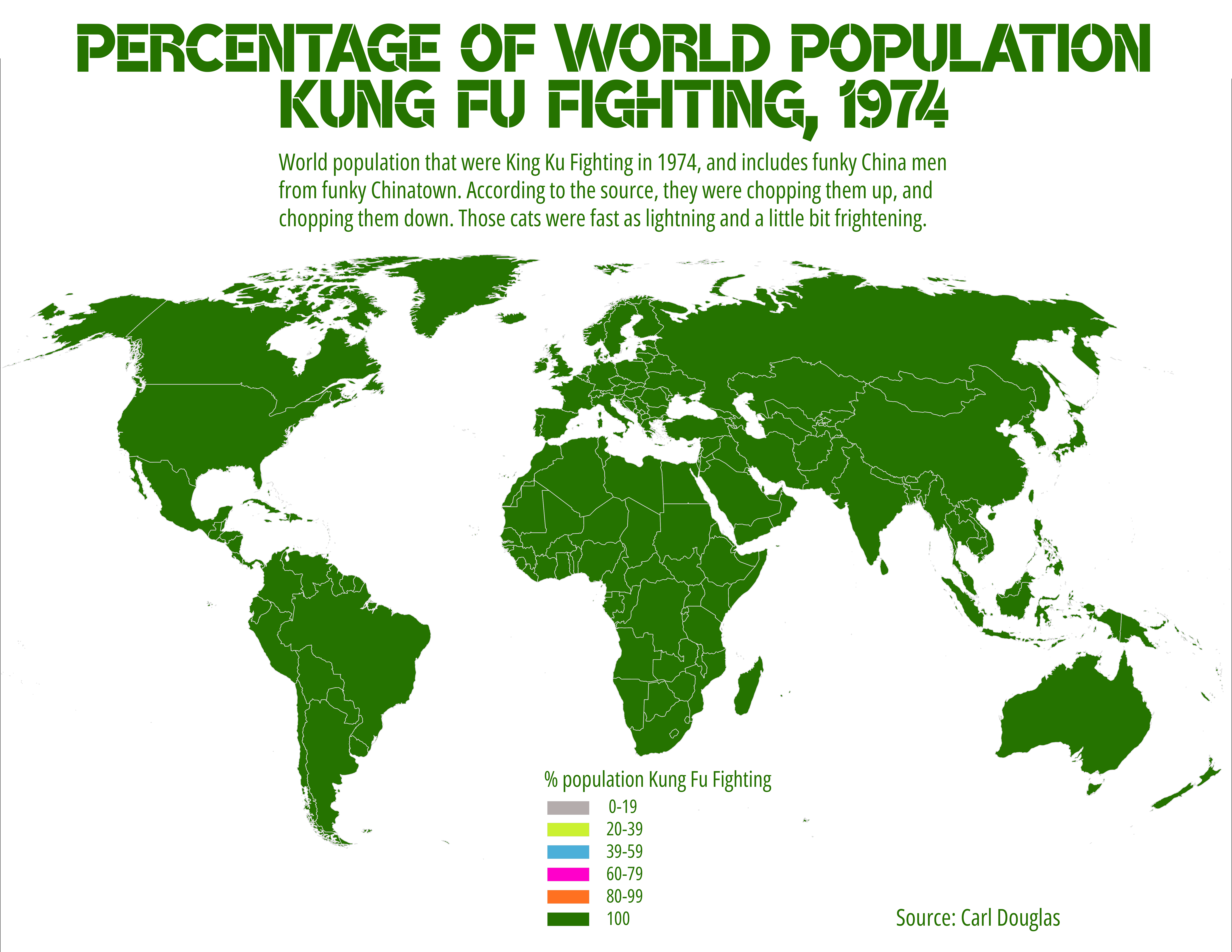
According to Carl Douglas, the percentage of the world population that practiced Kung Fu in 1974. Edited since most of you kids were not born when Carl Douglas, a Jamaican-British reggae singer, wrote the song. Google it, but do not blame me when you can't get the song out of your head.
Geography Joe December 13 2025Cartography, War in Ukraine, Analysis
Good Health and Well-Being in War-Torn Ukraine
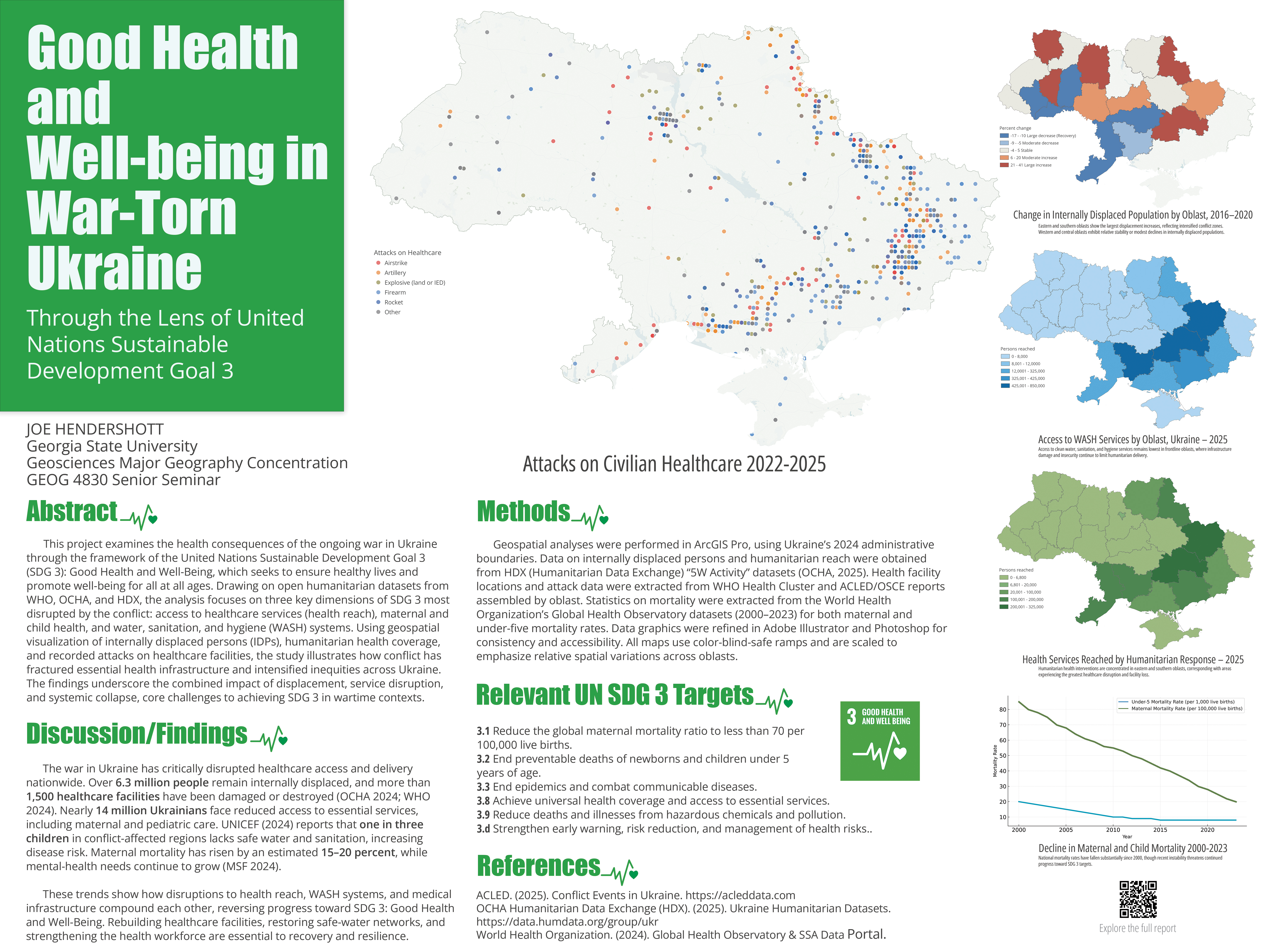
Here is a poster project completed recently. It did not get high marks. I have a different view than most people about these sorts of things. I feel that if you want to educate people, and that includes getting their attention, you have to something at least somewhat interesting visually. When I look at a poster with endless lines of text crammed into every inch with no regard for some design asthetics, I just do not even try to look at it. I believe it is something some many people in academia miss. They seem to just te things for others in academia, when perhaps some effort should be made to create things that the general public might learn from.
Back to the poster. It relates how the war has severly hampered Ukraine from reaching the United Nations goal of achieving good health. Data was extracted from the United Nations, WHO, Humanitarian Exchange, ACLED, and the Armed Forces of Ukraine. Data were cleaned up in Excel and imported into ArcGIS Pro where it was merged together to map spatially. Maps were exported and the poster was created with elements drawn in Adobe Illustrator and imported in Photoshop. The results were also published to my website and can be accessed via the QR code on the poster.
It took some effort, and a lot of time, but the lessons learned were well worth it.
Geography Joe December 13 2025Cartography, War in Ukraine, Analysis
Healthcare Under Attack in Ukraine
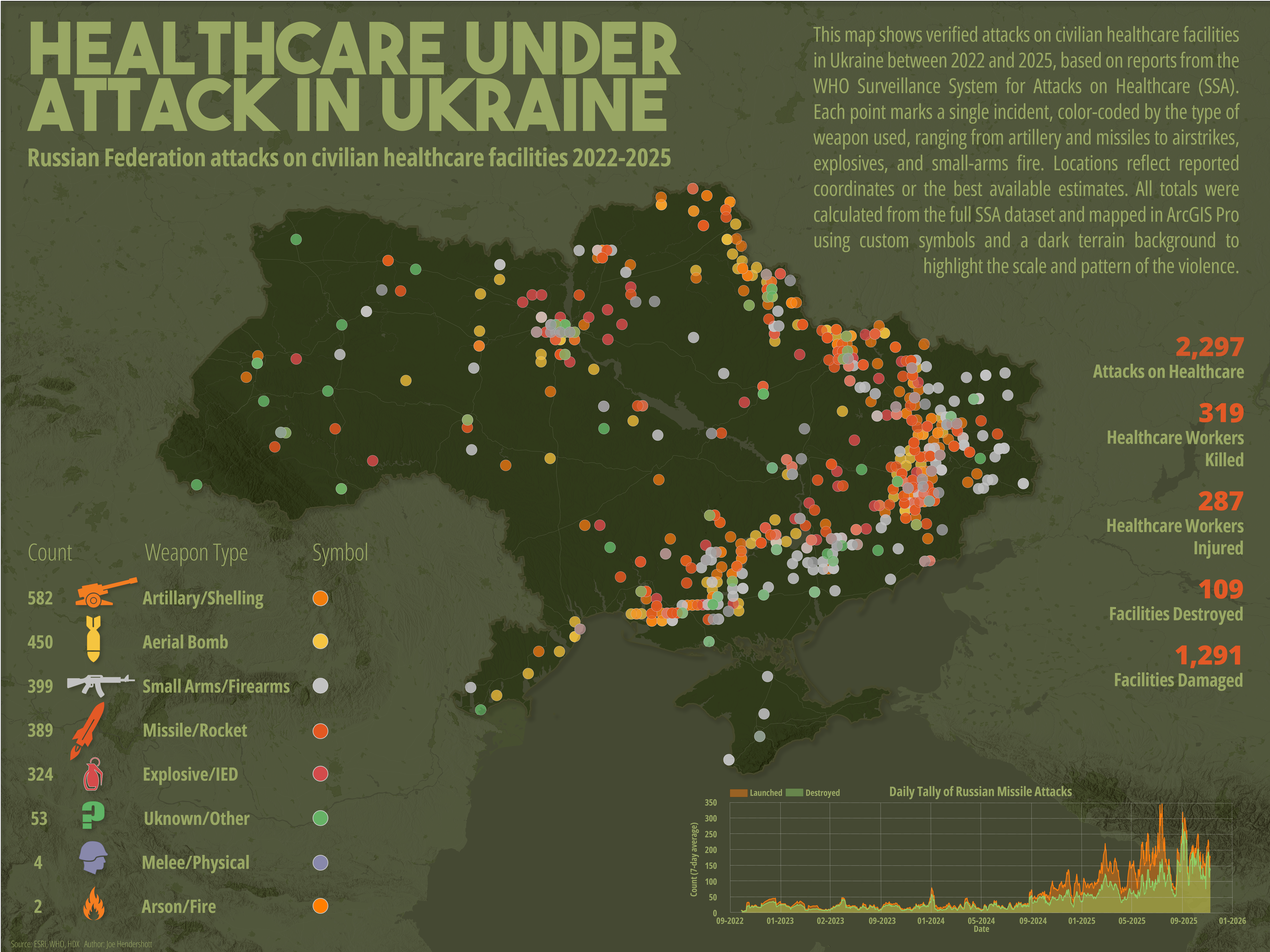
This map visualizes the spatial distribution, intensity, and weapon types associated with Russian attacks on civilian healthcare facilities from 2022 to 2025. Designed as both data driven visualization and a piece of public orientated communication, the map strives to make patterns of violence immediately legible: artillery strikes, missile attacks, aerial bombs, small-arms fire, explosives, and other forms of violence are symbolized distinctly to communicate their geographic clustering and human impact. The final layout integrates cartography, data analysis, and visual hierarchy to tell a story about the scale of harm inflicted on Ukraine’s health system over the course of the ongoing conflict.
Producing this map required several stages of work, identifying and acquiring the datasets, cleaning and preparing the attributes, analyzing and aggregating variables, and refining its design. Throughout this process, deliberate cartographic choices regarding how to structure a legend, balance color against a complex basemap, experiment with symbol sizes, evaluate clarity at multiple scales, and pair the map with explanatory graphics and summary statistics.
The core dataset used in this project comes from the WHO Surveillance System for Attacks on Healthcare (SSA), a global database cataloging verified incidents of violence against health personnel and facilities. The dataset includes dates, locations, perpetrators, weapon categories, and a wide range of incident outcomes, including health worker casualties, facility destruction, and damage to ambulances or medical transport.
Geography Joe December 13 2025Cartography
Per Capita Energy Consumption in Florida
Annual per capita energy consumption in the state of Florida at the county level. This map represents total electricity and natural gas consumption across residential, commercial and industrial sectors as of 2020 in megawatts (MW). Larger symbols represent counties with higher rates of useage.
Geography Joe December 12 2025Cartography, Analysis
Homocides Versus Traffic Fatalities in Metro Atlanta
This map compares two major sources of premature death in Metro Atlanta, motor vehicle crashes and homicides, using county level data for 2023. Police-reported homicides were obtained from the Georgia Bureau of Investigation’s Uniform Crime Reporting (UCR) Program, while traffic fatality counts come from the Georgia Governor’s Office of Highway Safety County Fact Sheets, which report occurrence based motor vehicle deaths. Rather than mapping each category separately, the analysis visualizes the difference between traffic fatalities and homicides to highlight where one risk outweighs the other.
Recent news reporting has suggested that traffic fatalities now exceed homicides in parts of Metro Atlanta. This map provides spatial context for that claim, showing that while homicides remain concentrated in a small number of counties, traffic deaths exceed homicide counts across much of the region. The results underscore how transportation safety has emerged as a major public health concern, even in areas where violent crime receives greater public attention. Together, these patterns suggest the need for policy responses that address both roadway design and traffic behavior alongside traditional crime prevention strategies.
Geography Joe December 11 2025Cartography, Analysis
Violent Crime in Atlanta by Neighborhood
This map visualizes neighborhood-level patterns of violent crime in Atlanta during 2024 using police incident data. For this project, “violent crime against persons” is defined according to the FBI’s NIBRS categories and includes offenses such as homicide, aggravated assault, robbery, rape, sexual assault, and kidnapping. These incidents represent situations where force or the threat of force was used against an individual. By summarizing these events within defined neighborhood boundaries, the map provides a clearer geographic perspective on where interpersonal violence is most concentrated within the city.
I began with a cleaned dataset of all 2024 police incidents, which included a field identifying whether an offense qualified as a violent crime. This layer was spatially joined to an Atlanta neighborhood polygon file, producing a field showing the total number of violent crimes within each neighborhood. Five class breaks were created to distinguish low, moderate-, and high-incident areas. A muted basemap ensures that neighborhood patterns remain visually dominant while still providing geographic context.
The resulting map highlights neighborhoods where violent crime is disproportionately concentrated, particularly in central and south-central parts of the city. These patterns often reflect long-term structural factors such as economic inequality, housing precarity, historical disinvestment, and limited access to social resources. While the map does not explain the causes directly, it provides an important spatial framework for policymakers, community organizations, and residents seeking to understand and address safety concerns. It also reinforces the need for targeted, community-informed violence prevention strategies rather than one-size-fits-all approaches.
While this map provides a useful overview of where violent crime incidents were reported in 2024, it should not be interpreted as a complete or definitive picture of community safety. Crime data reflect only incidents that are reported to and recorded by law enforcement, meaning some neighborhoods may appear lower in crime simply because of underreporting or differences in police presence. Neighborhood boundaries also do not necessarily match how residents experience their communities, and a higher count does not explain the underlying social or economic conditions that contribute to violence. Finally, the map shows totals rather than population-adjusted rates, so areas with more residents or more activity may naturally have higher counts. For these reasons, the map should be understood as one perspective on violence and not a full account of community risk, lived experience, or the broader structural factors influencing crime patterns.
Geography Joe December 10 2025Cartography, Analysis
Urbanization and Carbon Emissions
This bivariate choropleth map visualizes the relationship between urbanization (% urban population) and annual carbon emissions using country-level data from the United Nations Data Portal and ESRI’s global administrative boundaries. Both variables were classified into three equal-interval categories, producing a 3×3 matrix of nine color combinations. Blue hues represent higher emissions, red hues represent higher urbanization, and blended shades show intermediate conditions.
The map was projected using the World Robinson coordinate system to provide a visually balanced global view. Data was cleaned and joined in ArcGIS Pro, then symbolized using a custom bivariate color scheme created in the Color Scheme Editor. The final map highlights broad global patterns, such as high-urban/high-emission countries in North America and Western Europe, and low-urban/low-emission countries in Sub-Saharan Africa.
Geography Joe December 09 2025Cartography, Hydrology, Analysis
Wastewater Treatment Plants in the United States
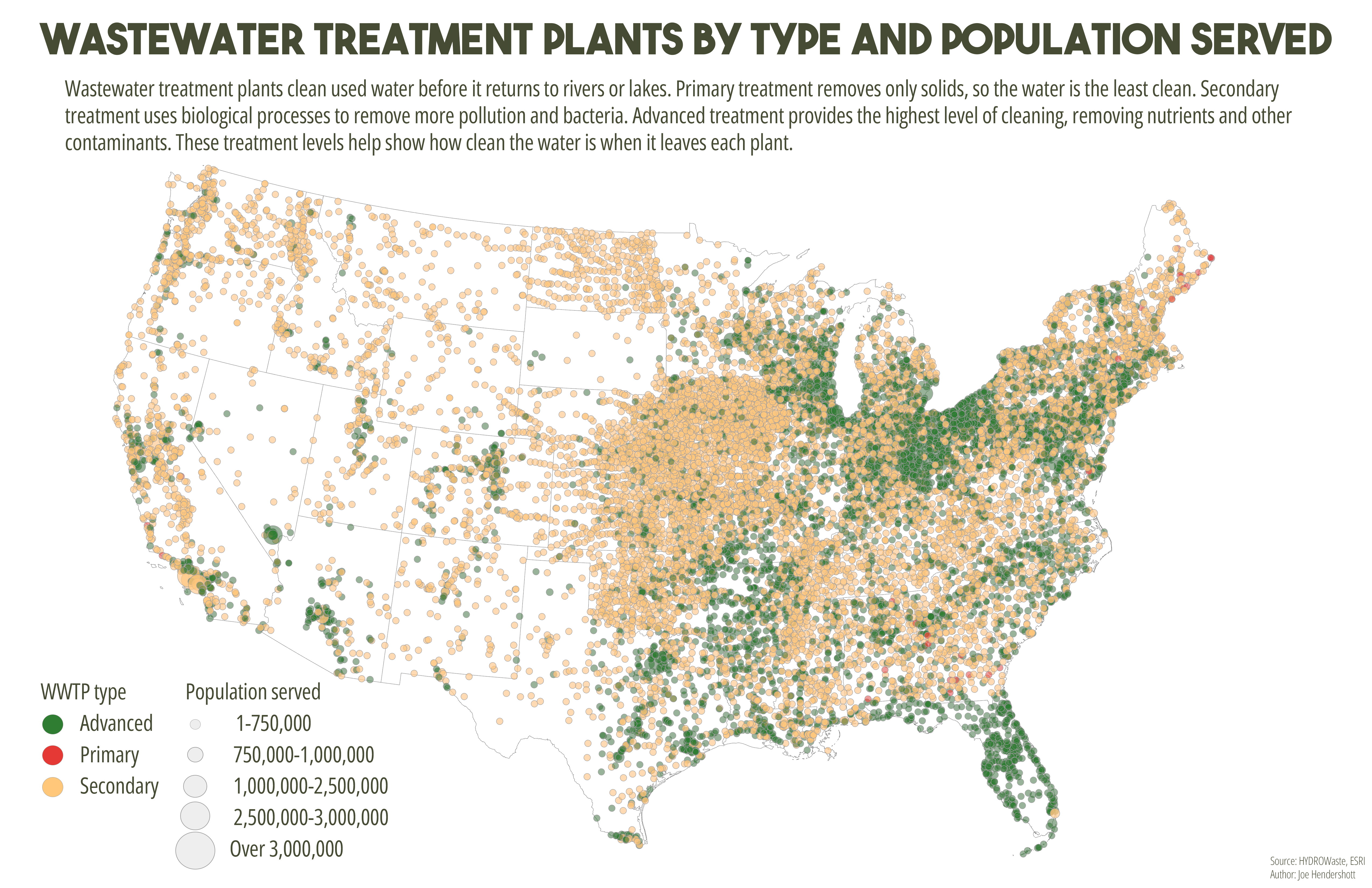
This map shows wastewater treatment plants across the United States using both color and size to represent different characteristics. Each point marks the location of a treatment plant. Color indicates the level of treatment provided: primary treatment removes basic solids, secondary treatment removes additional pollutants and bacteria, and advanced treatment provides the highest level of cleaning by removing nutrients and other contaminants. The size of each circle represents the number of people served by that plant, with larger circles indicating facilities that serve larger populations. Combining these elements allows the map to show both treatment quality and system scale at the same time.
The map reveals strong regional differences in wastewater infrastructure across the country. Advanced treatment plants are more common in densely populated regions, particularly along the East Coast, Great Lakes, and parts of the West Coast, where environmental regulations and population density are higher. Much of the central United States is dominated by smaller facilities providing secondary treatment, reflecting more rural service areas and lower population densities. A small number of very large plants serve major metropolitan regions, highlighting how urban areas rely on centralized infrastructure, while rural areas depend on many smaller, less complex systems. Together, these patterns illustrate how wastewater treatment capacity and quality are closely tied to population distribution, regional development, and environmental policy.
Comments