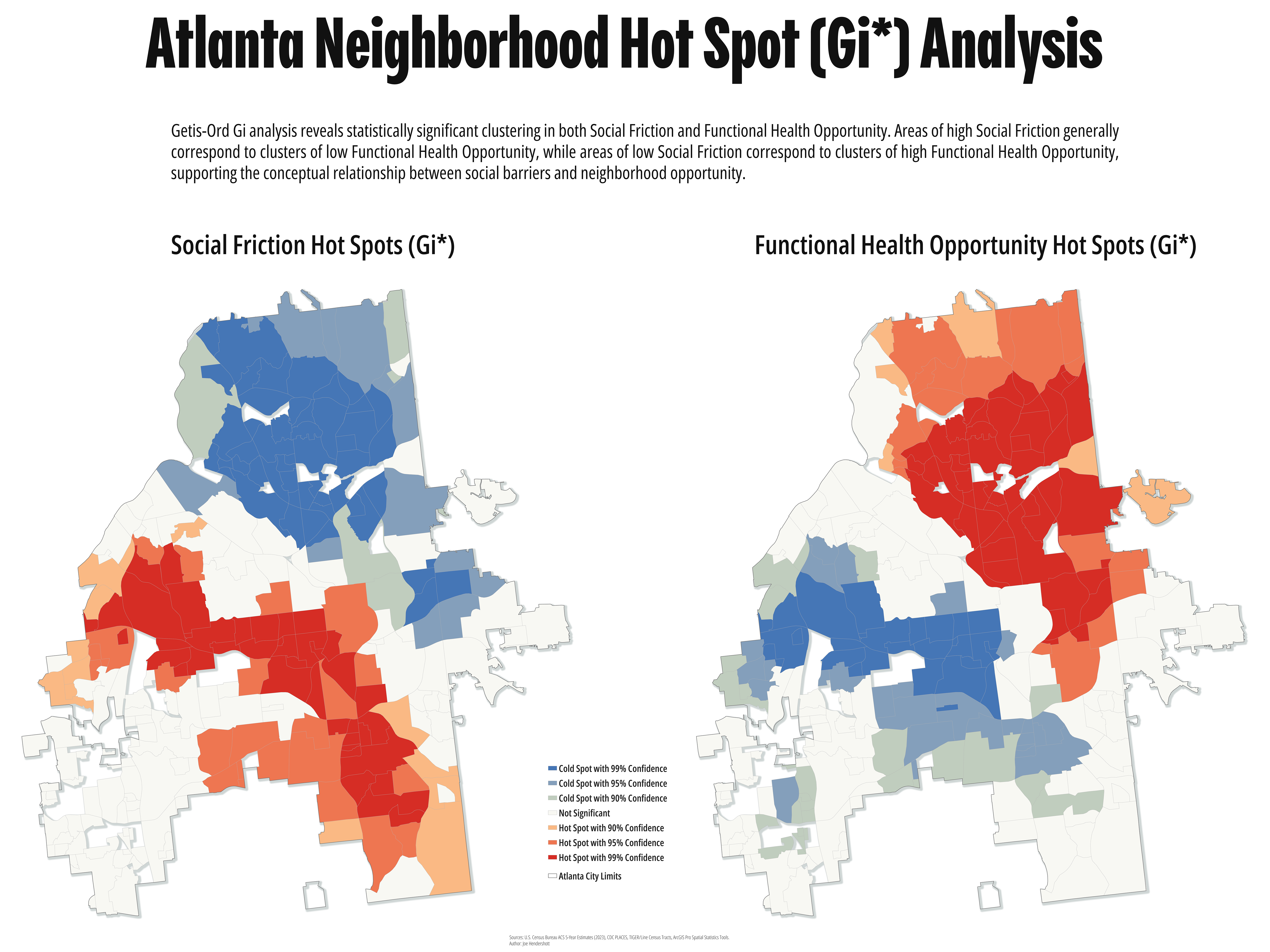
These two maps are pretty cool and almost what I expected to see. They show not random noise, but spatial clustering. Comparing the Social Friction and Functional Health Opportunity hot spot maps reveals a strong inverse spatial relationship across Atlanta.
Neighborhoods identified as statistically significant clusters of high Social Friction generally correspond to clusters of low Functional Health Opportunity, while areas with low Social Friction align with clusters of high opportunity. The large, contiguous 95% and 99% confidence clusters suggest these patterns reflect broader geographic processes rather than isolated neighborhoods or random variation.
While Social Friction is a major component of the Functional Health Opportunity framework, the two maps are not simple inverses of one another. The Functional Health Opportunity index also incorporates healthcare accessibility, food environments, and cardiometabolic health, producing a more comprehensive measure of neighborhood opportunity. The similarity between the two hot spot patterns suggests that social conditions play a foundational role in shaping health opportunity, while the additional variables refine where opportunity is ultimately highest or lowest across the city.
Atlanta Neighborhood Hot Spot Analysis
Comments

Leave a Comment
Commenting is not available in this channel entry.

Hello, I am Joe Hendershott, a geographer and cartographer based in Atlanta, Georgia.
Popular Posts

Explore Topics
No comments yet.