

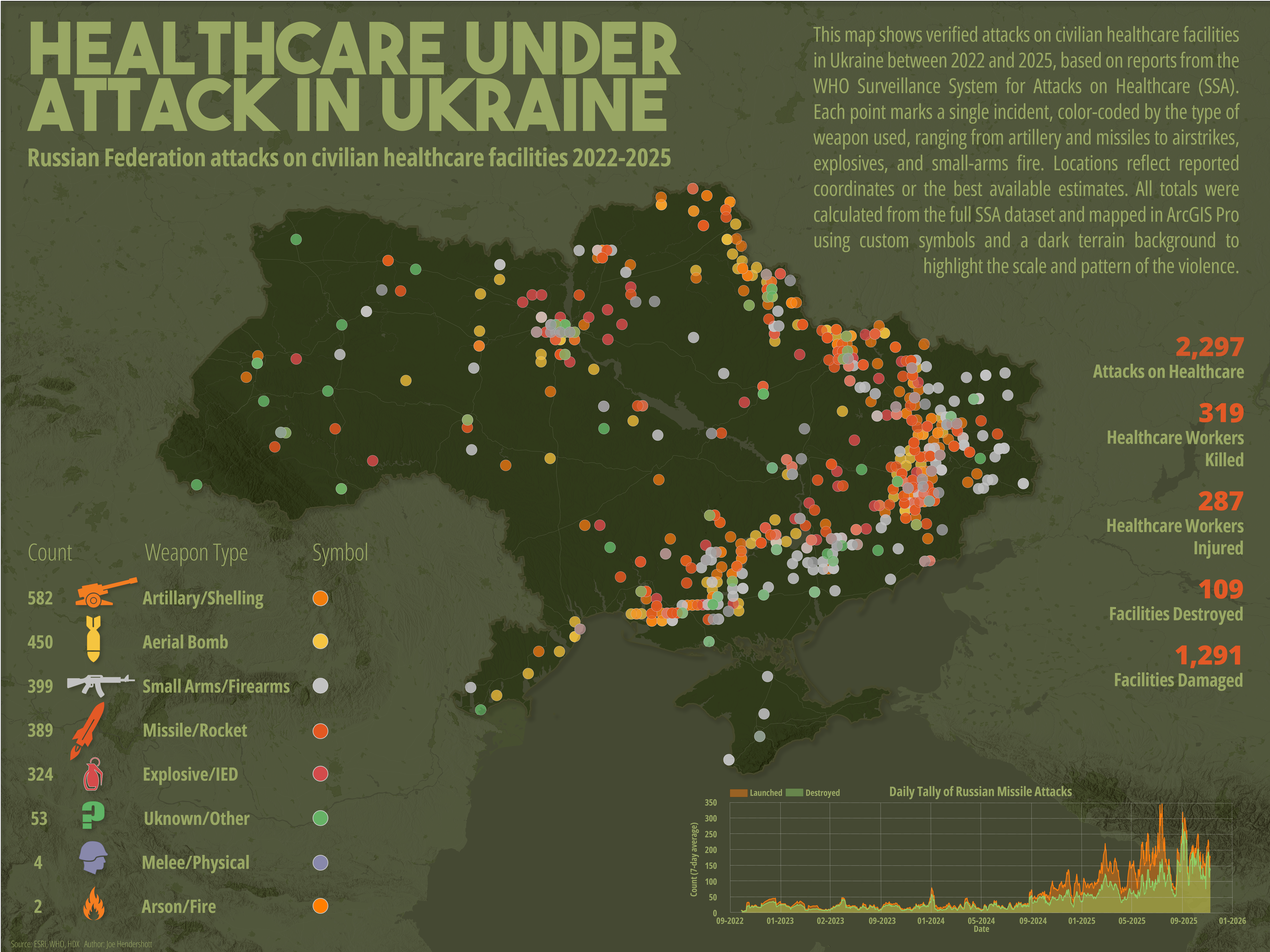
This map visualizes the spatial distribution, intensity, and weapon types associated with Russian attacks on civilian healthcare facilities from 2022 to 2025. Designed as both data driven visualization and a piece of public orientated communication, the map strives to make patterns of violence immediately legible: artillery strikes, missile attacks, aerial bombs, small-arms fire, explosives, and other forms of violence are symbolized distinctly to communicate their geographic clustering and human impact. The final layout integrates cartography, data analysis, and visual hierarchy to tell a story about the scale of harm inflicted on Ukraine’s health system over the course of the ongoing conflict.
Producing this map required several stages of work, identifying and acquiring the datasets, cleaning and preparing the attributes, analyzing and aggregating variables, and refining its design. Throughout this process, deliberate cartographic choices regarding how to structure a legend, balance color against a complex basemap, experiment with symbol sizes, evaluate clarity at multiple scales, and pair the map with explanatory graphics and summary statistics.
The core dataset used in this project comes from the WHO Surveillance System for Attacks on Healthcare (SSA), a global database cataloging verified incidents of violence against health personnel and facilities. The dataset includes dates, locations, perpetrators, weapon categories, and a wide range of incident outcomes, including health worker casualties, facility destruction, and damage to ambulances or medical transport.
Geography Joe December 13 2025Cartography, War in Ukraine, Analysis
Healthcare Under Attack in Ukraine
Comments
No comments yet.