
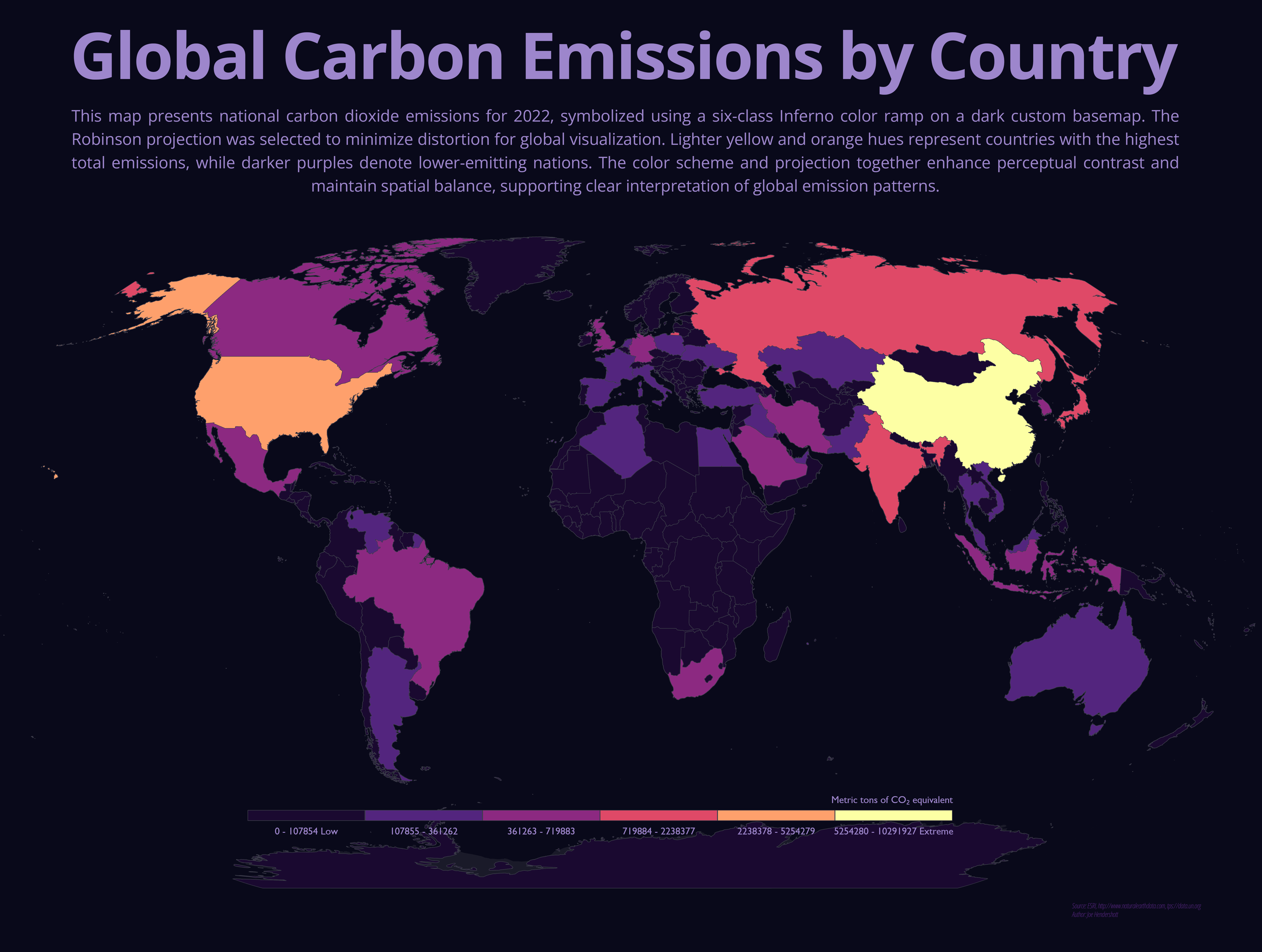
This map shows total national carbon dioxide emissions for countries around the world in 2022. Each country is shaded using a graduated color scale, where darker purples represent lower emissions and lighter yellow-orange tones indicate higher emissions. A global map projection was used to present the world in a balanced way, helping preserve the relative size and position of countries for comparison. The dark background and high-contrast color scheme make differences between countries easier to see, especially when viewing global patterns rather than local detail.
The map highlights how global carbon emissions are concentrated in a relatively small number of countries. China and the United States stand out as the largest emitters, followed by other highly industrialized or rapidly developing nations such as India and Russia. Much of Africa, South America, and smaller nations show lower total emissions, reflecting lower levels of industrial activity and energy consumption. These patterns illustrate the uneven global contribution to climate change and help explain why international climate policy often focuses on cooperation between major emitting countries, even though climate impacts are felt worldwide.
Comments
No comments yet.