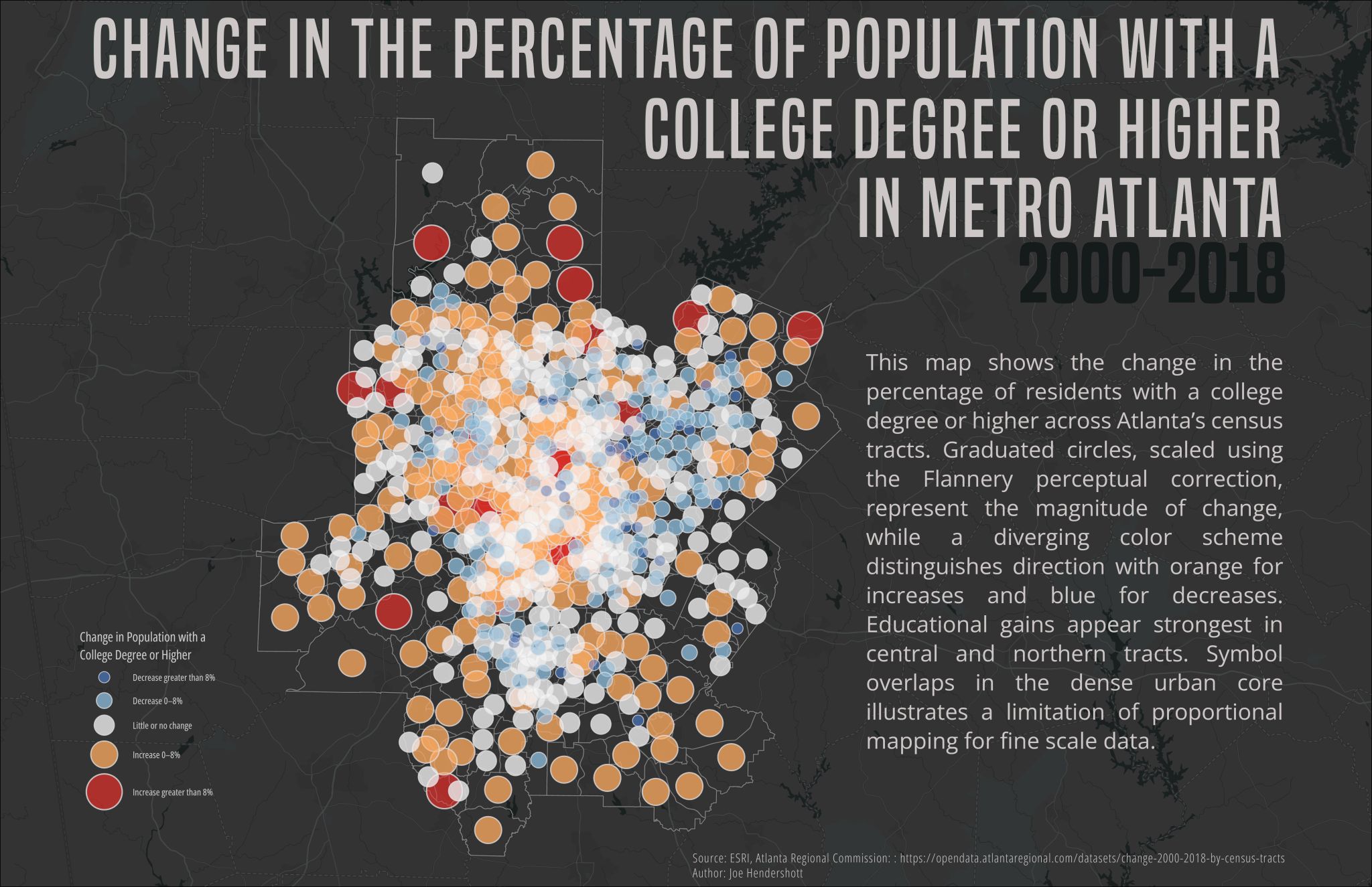
This map shows how the share of residents with a college degree or higher changed across Metro Atlanta census tracts between 2000 and 2018. Each circle represents a census tract and is sized based on the magnitude of…
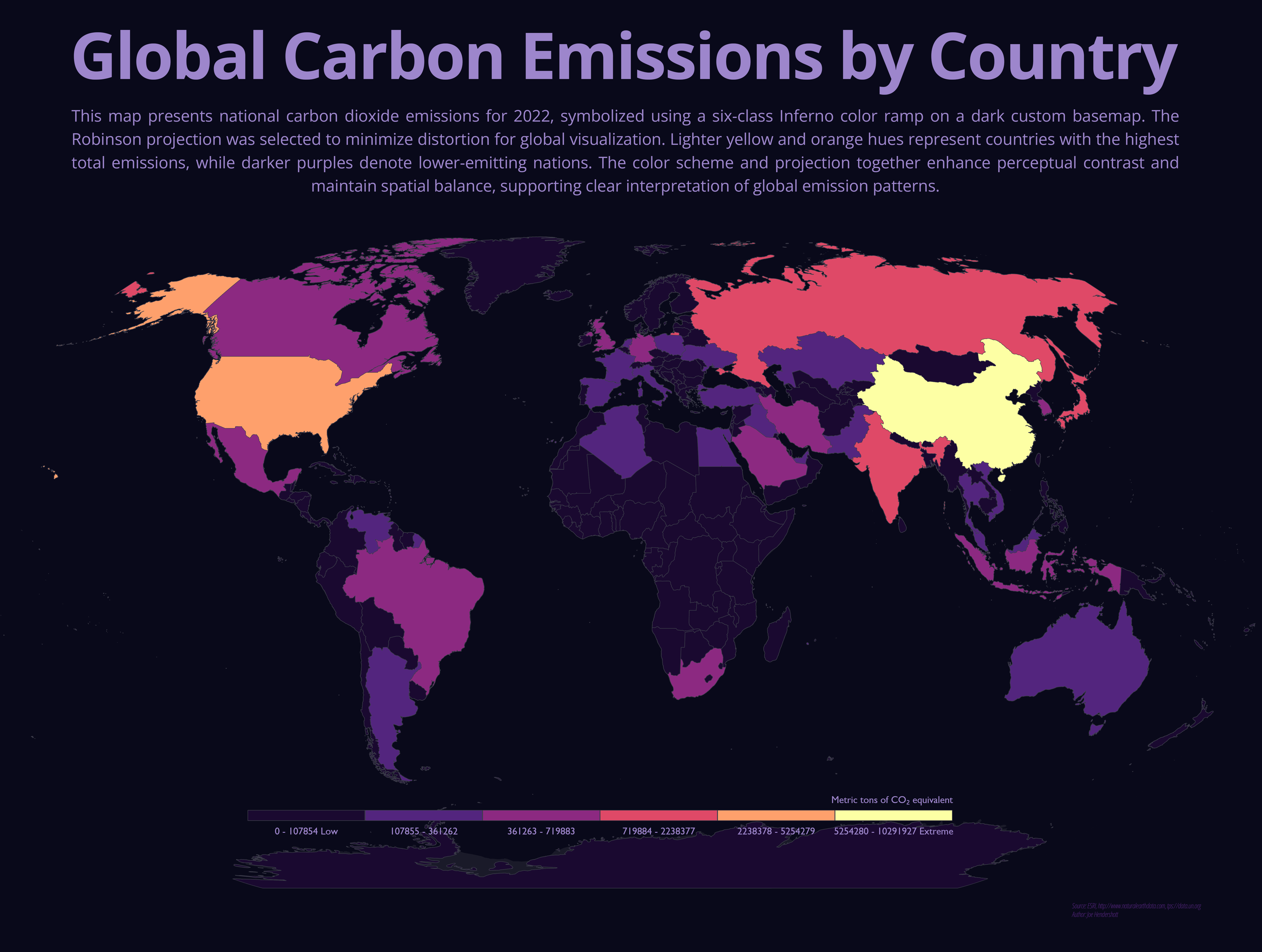
This map shows total national carbon dioxide emissions for countries around the world in 2022. Each country is shaded using a graduated color scale, where darker purples represent lower emissions and lighter…
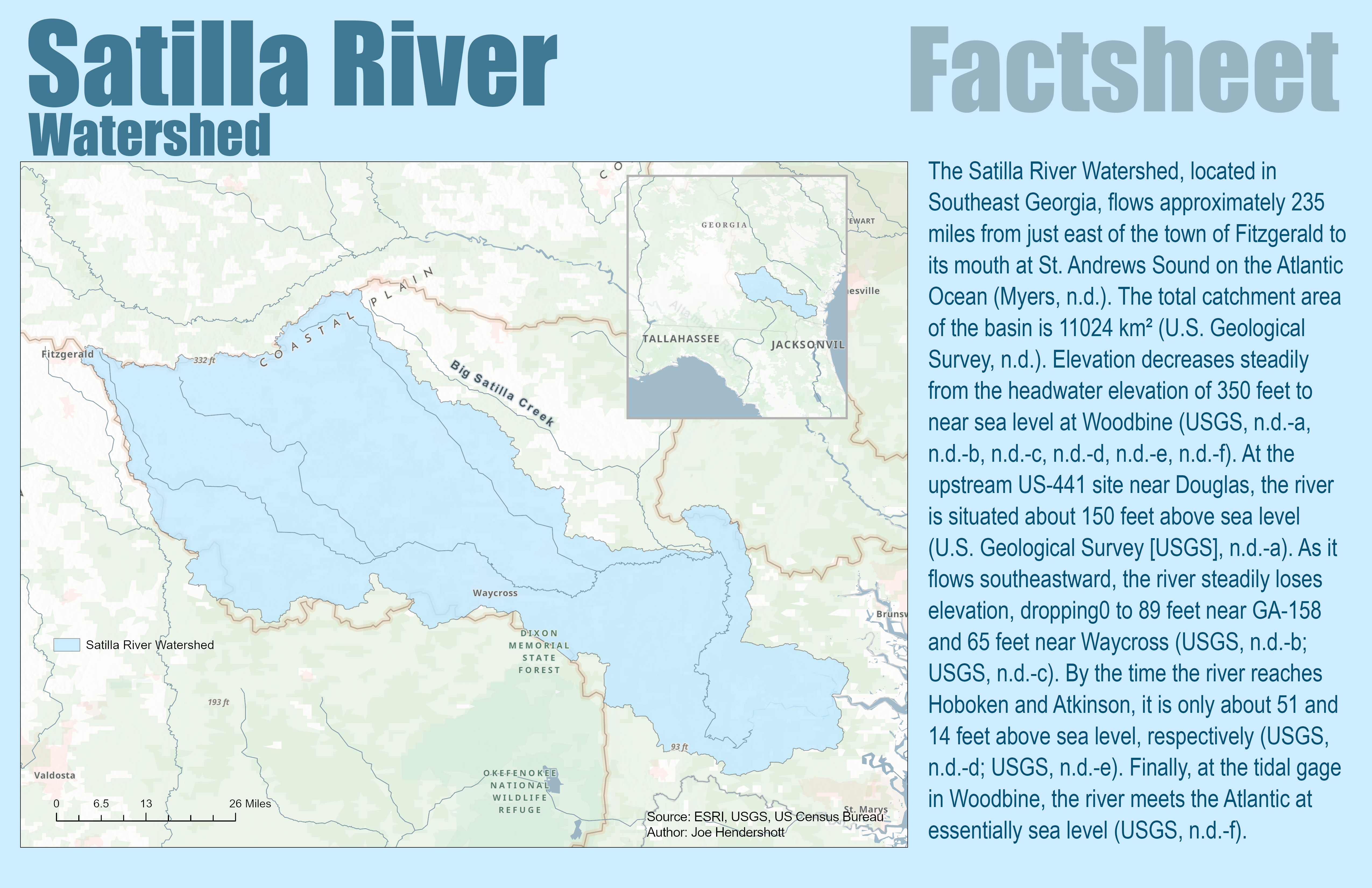
This factsheet provides an overview of the Satilla River Watershed in southeast Georgia, tracing the river from its headwaters near Fitzgerald to its mouth at St. Andrews Sound on the Atlantic coast. The Satilla River…
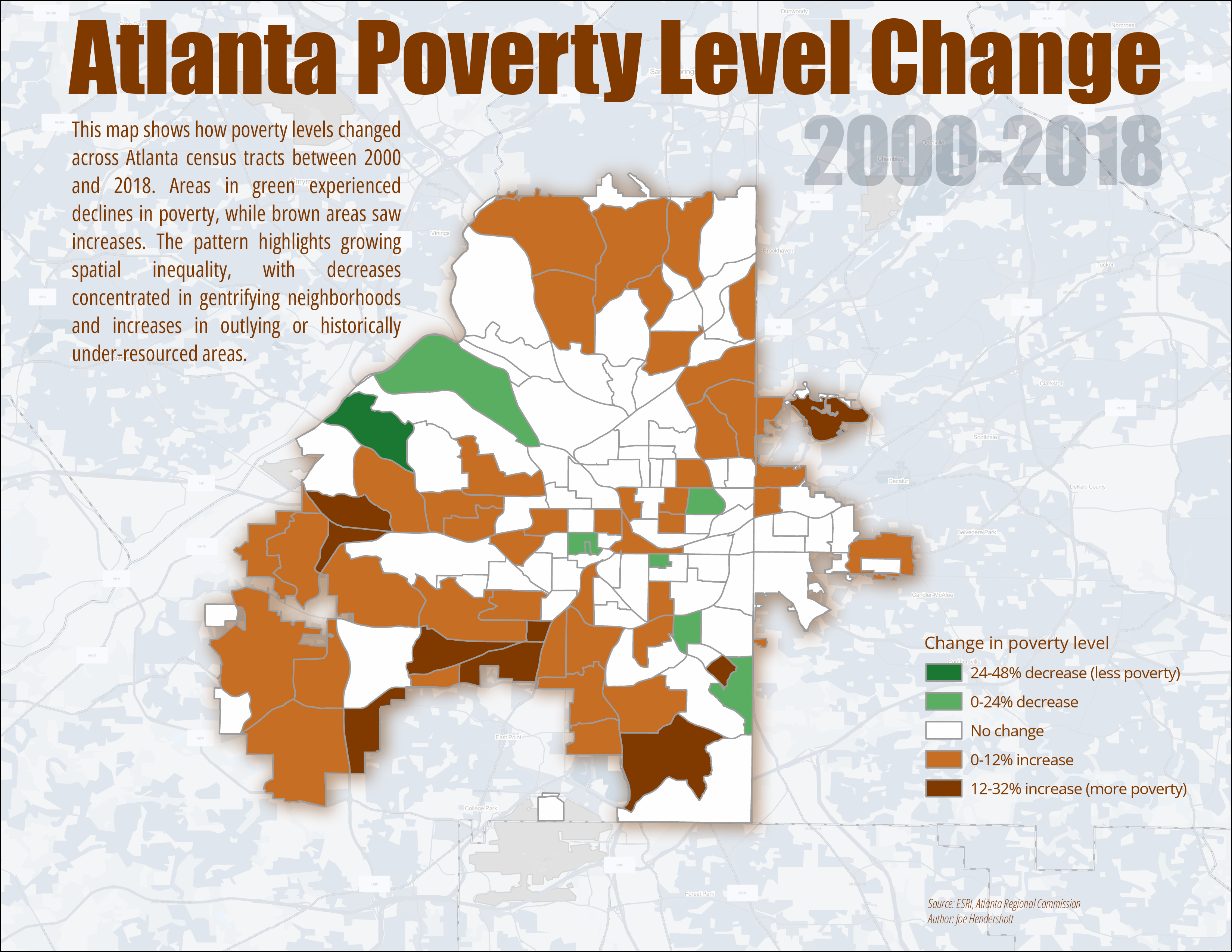
This map shows how poverty levels changed across Atlanta census tracts between 2000 and 2018. Each tract is colored based on the percentage increase or decrease in the share of residents living below the poverty line…
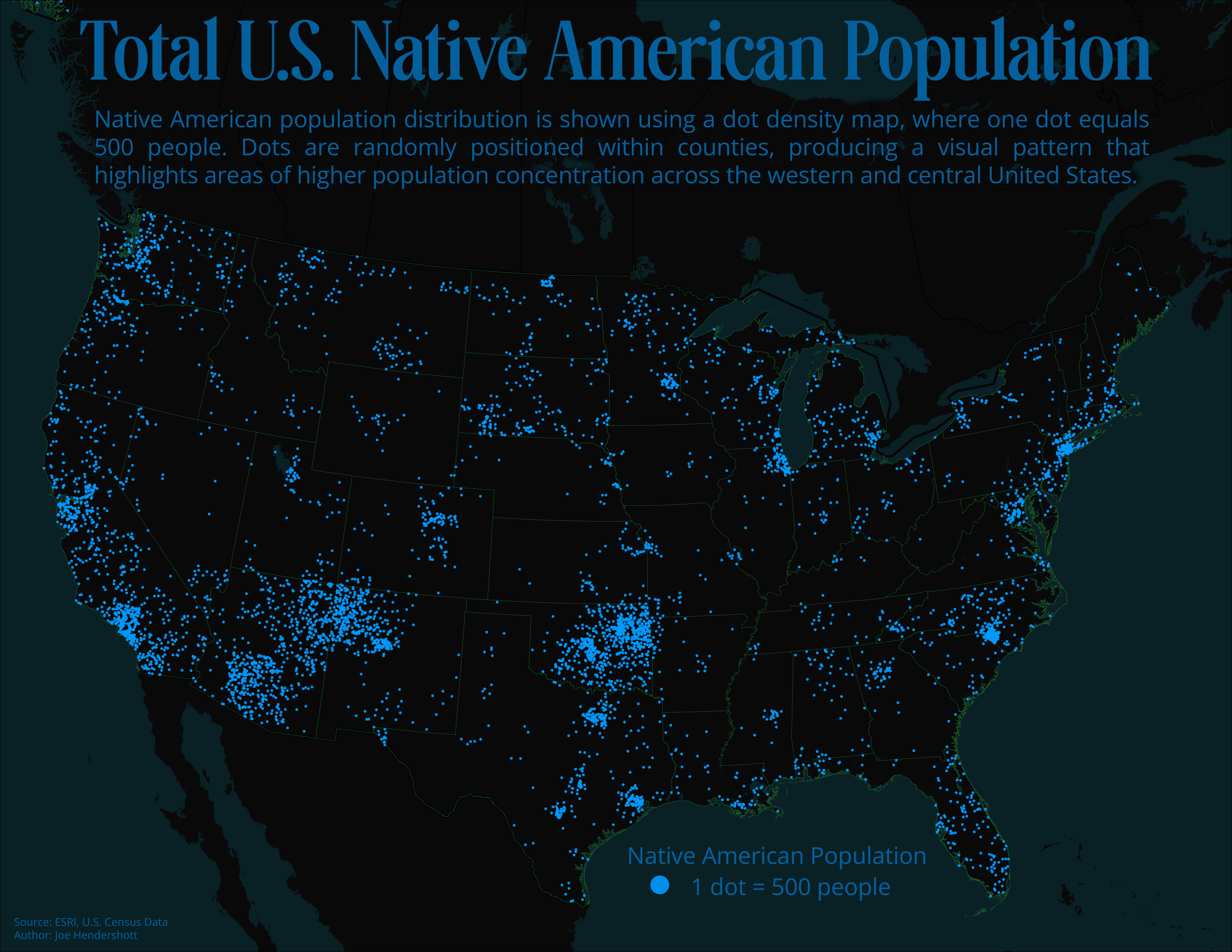
This map uses a dot density approach to show the distribution of the Native American population across the United States. Each dot represents 500 people and is randomly placed within county boundaries, so areas with more…
