

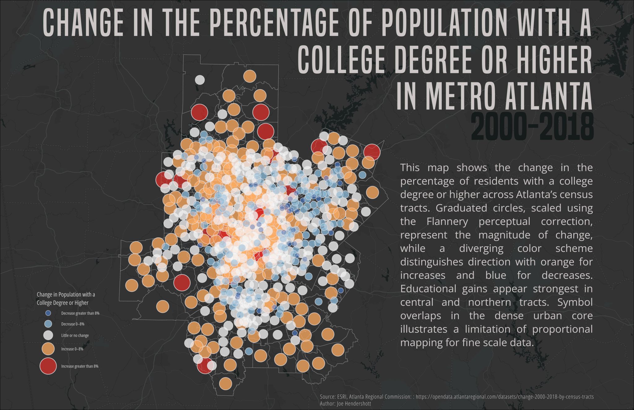
This map shows how the share of residents with a college degree or higher changed across Metro Atlanta census tracts between 2000 and 2018. Each circle represents a census tract and is sized based on the magnitude of change, so larger circles indicate bigger shifts over time. Color shows the direction of change: warm colors represent increases in educational attainment, while cool colors indicate decreases, and neutral tones show little or no change. Using circles instead of shaded areas allows both the size and direction of change to be shown at the same time across the region.
The map reveals strong spatial differences in educational change across Metro Atlanta. Increases in college-educated populations are most pronounced in central and northern parts of the region, particularly in areas that have experienced redevelopment and population growth. In contrast, some southern and outer tracts show smaller gains or declines, suggesting uneven access to educational and economic opportunity. Together, these patterns highlight how educational attainment has become increasingly concentrated in certain neighborhoods, reinforcing broader trends of inequality and segregation within the metropolitan area.
Comments
No comments yet.