

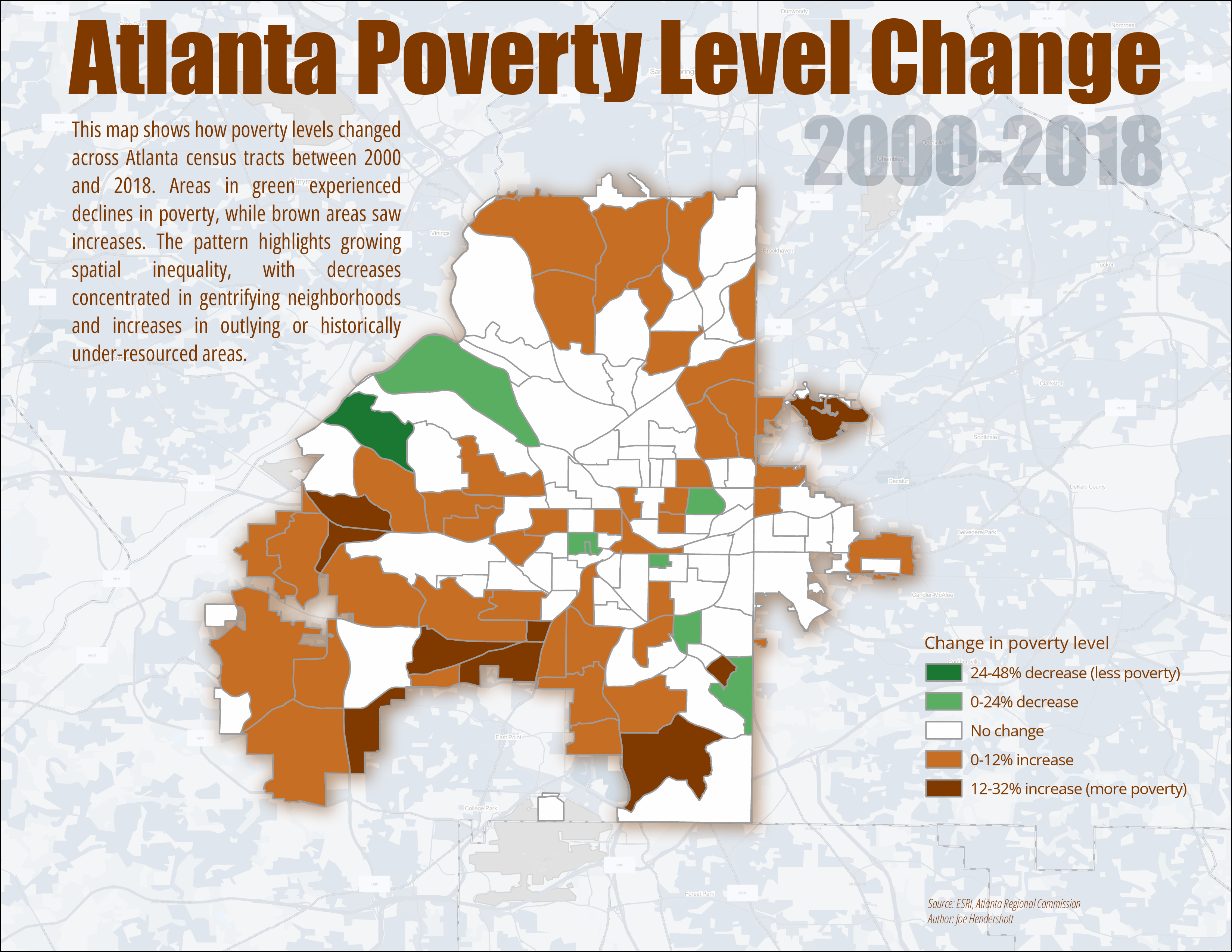
This map shows how poverty levels changed across Atlanta census tracts between 2000 and 2018. Each tract is colored based on the percentage increase or decrease in the share of residents living below the poverty line over that period. Green areas indicate places where poverty declined, while brown areas show where poverty increased, with darker shades representing larger changes. Census tracts with little or no measurable change are shown in white. Using census tracts allows for neighborhood-level comparisons while keeping the data consistent across time.
The map reveals uneven changes in poverty across Atlanta, highlighting growing spatial inequality within the city. Declines in poverty are concentrated in a small number of central and west-side neighborhoods that have experienced redevelopment and gentrification. In contrast, many southern and peripheral areas show rising poverty, suggesting that economic hardship has shifted outward rather than disappeared. Together, these patterns illustrate how neighborhood change in Atlanta has often involved displacement and redistribution of poverty, rather than broad-based economic improvement across the city.
Comments
No comments yet.