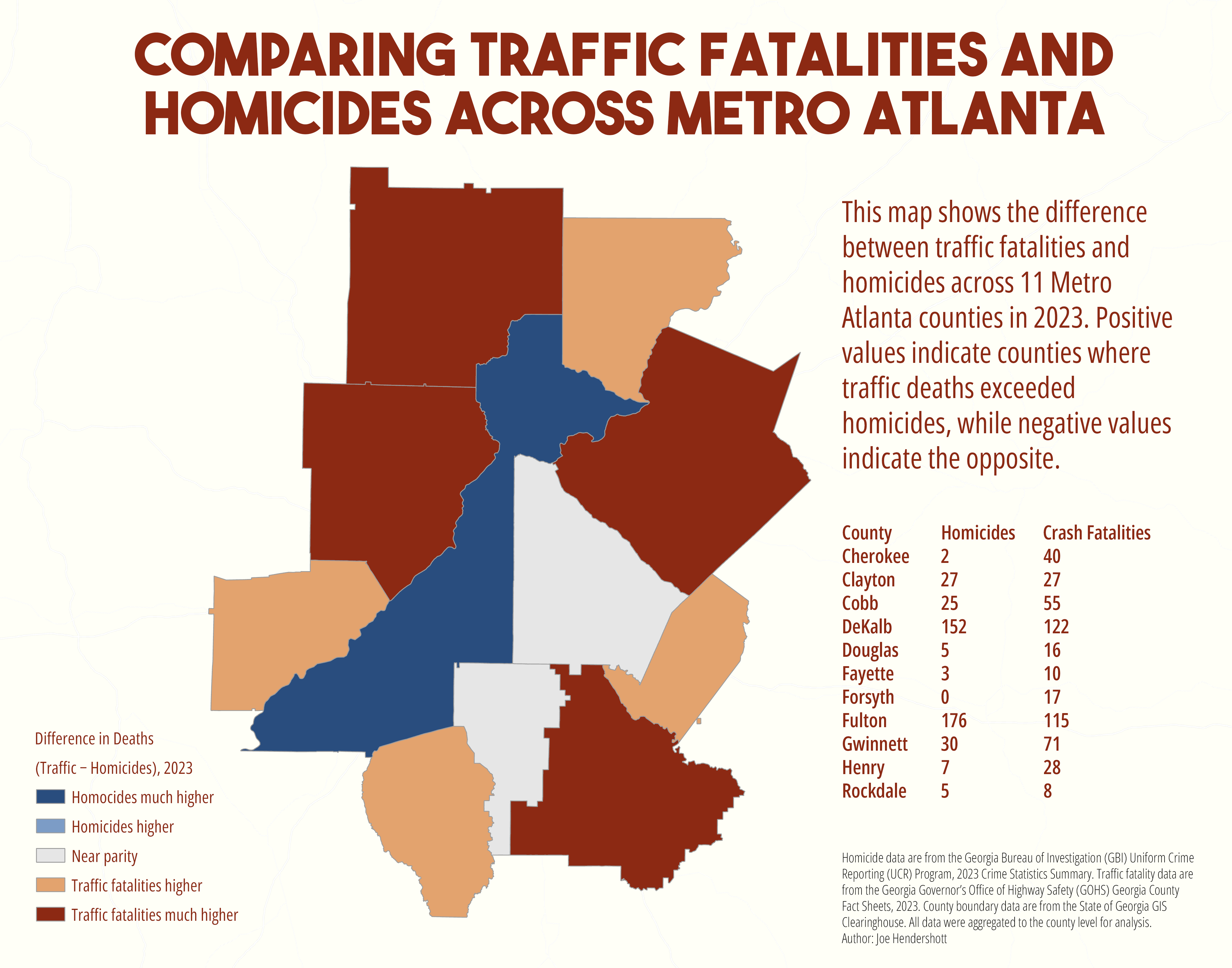
This map compares two major sources of premature death in Metro Atlanta, motor vehicle crashes and homicides, using county level data for 2023. Police-reported homicides were obtained from the Georgia Bureau of…
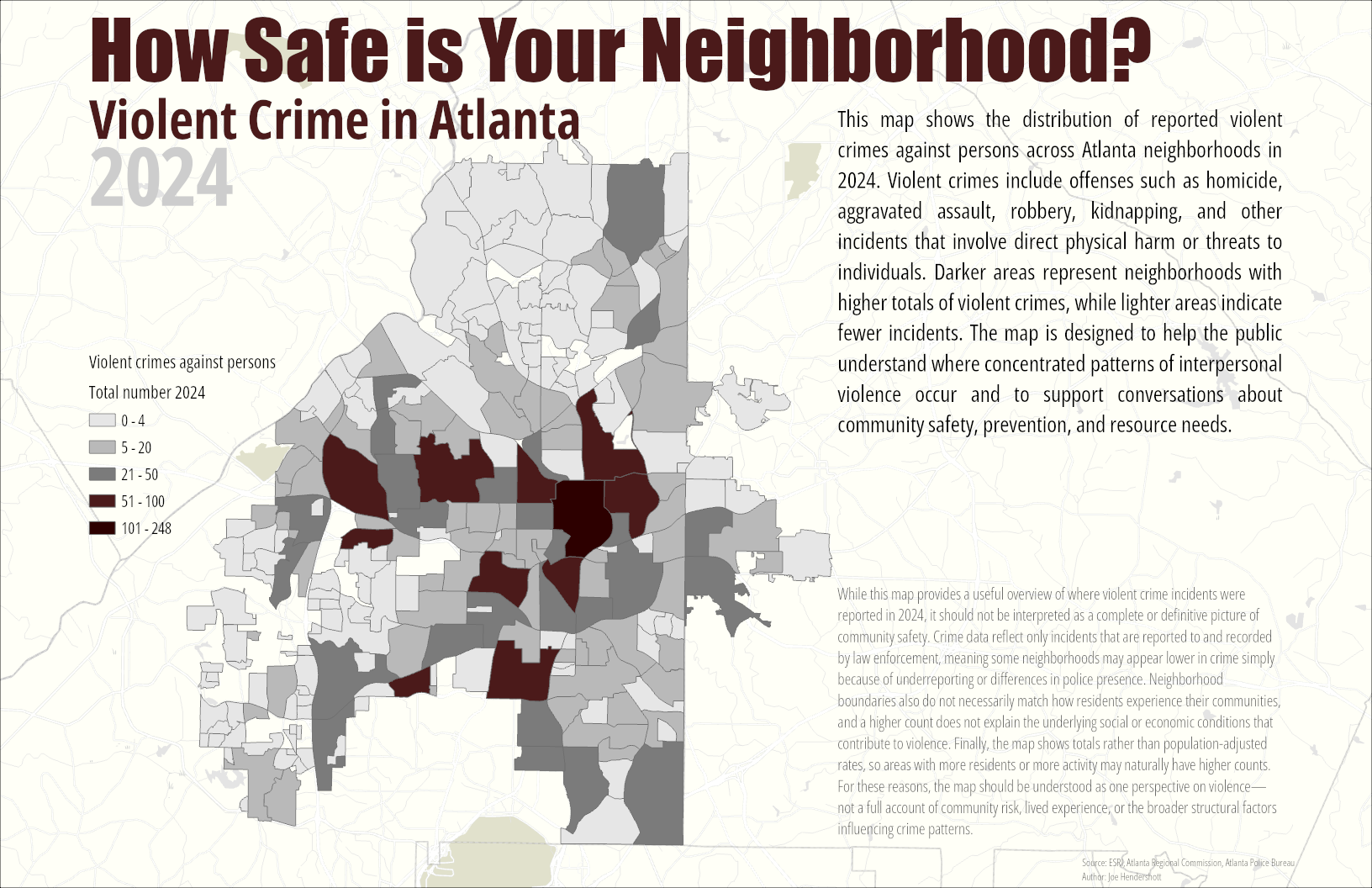
This map visualizes neighborhood-level patterns of violent crime in Atlanta during 2024 using police incident data. For this project, “violent crime against persons” is defined according to the FBI’s NIBRS…
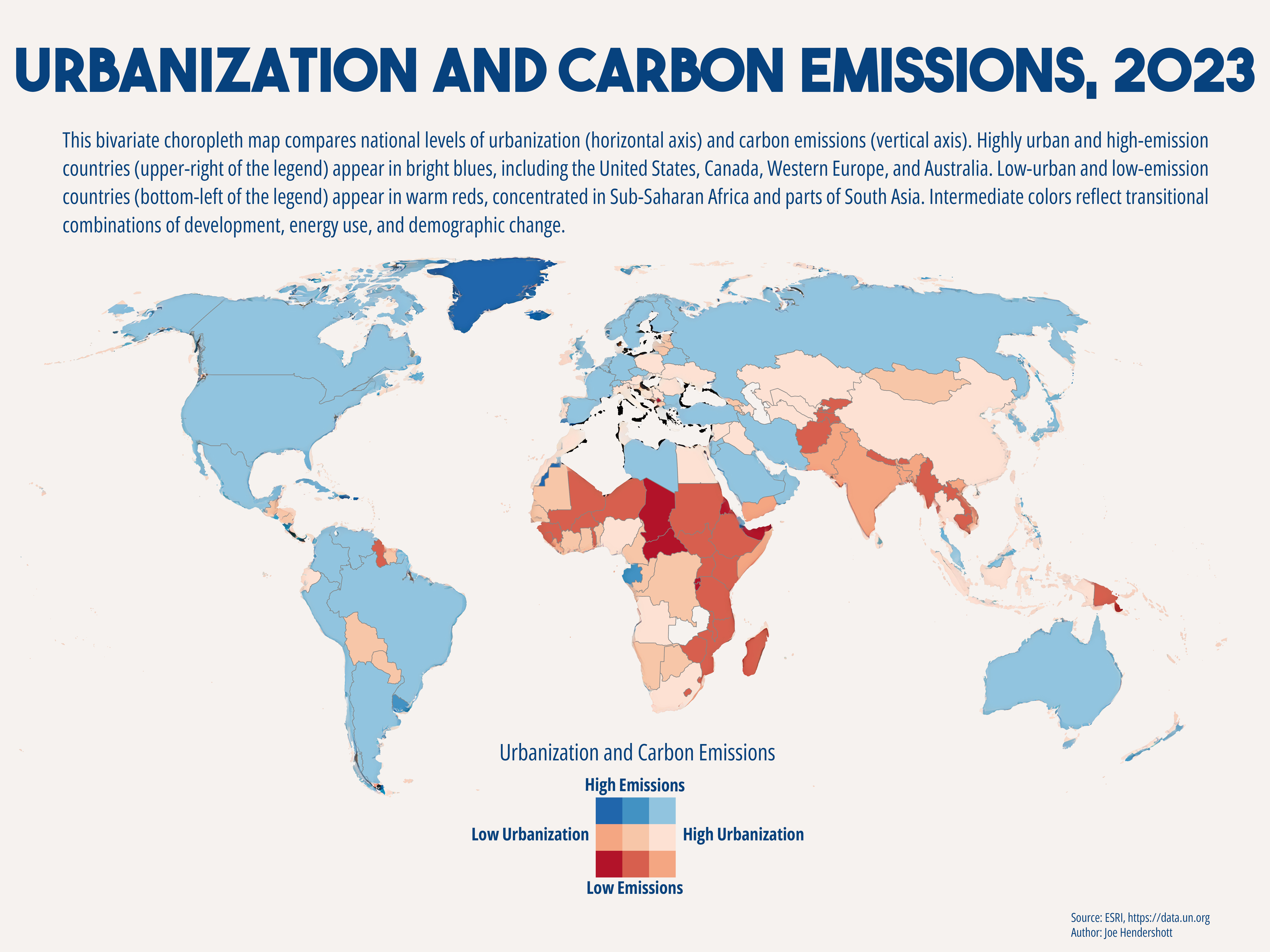
This bivariate choropleth map visualizes the relationship between urbanization (% urban population) and annual carbon emissions using country-level data from the United Nations Data Portal and ESRI’s global…
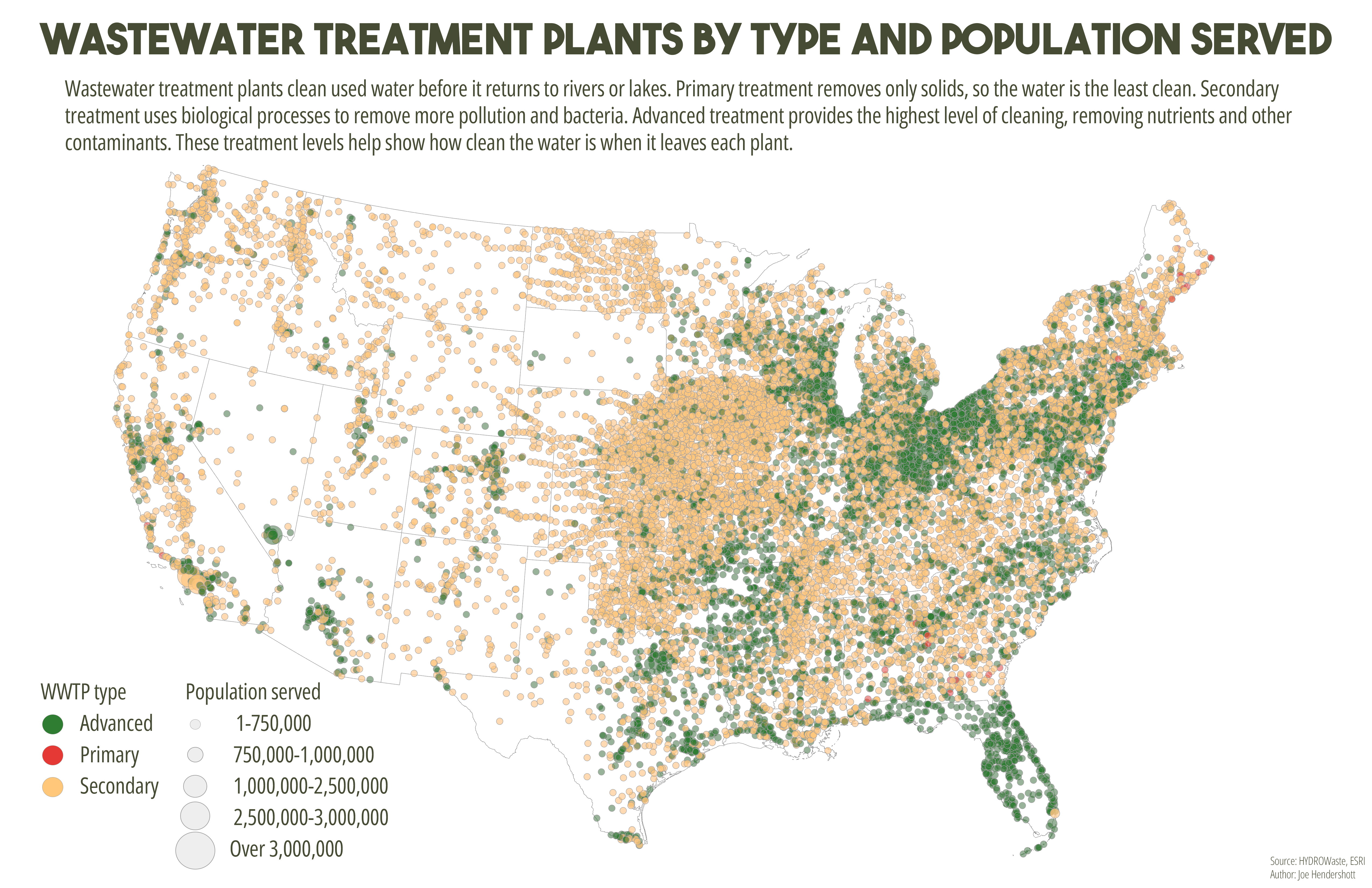
This map shows wastewater treatment plants across the United States using both color and size to represent different characteristics. Each point marks the location of a treatment plant. Color indicates the level of…
