

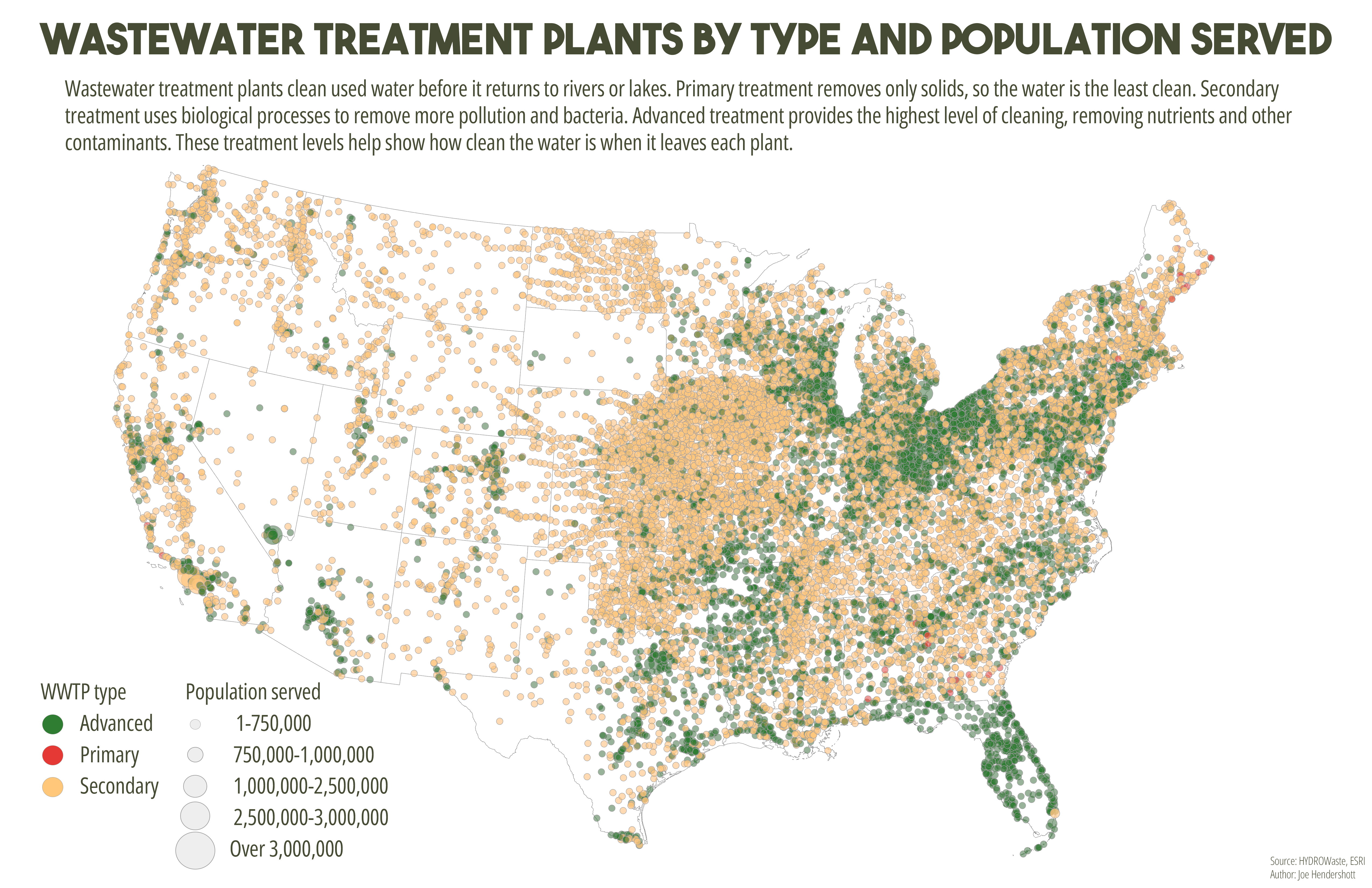
This map shows wastewater treatment plants across the United States using both color and size to represent different characteristics. Each point marks the location of a treatment plant. Color indicates the level of treatment provided: primary treatment removes basic solids, secondary treatment removes additional pollutants and bacteria, and advanced treatment provides the highest level of cleaning by removing nutrients and other contaminants. The size of each circle represents the number of people served by that plant, with larger circles indicating facilities that serve larger populations. Combining these elements allows the map to show both treatment quality and system scale at the same time.
The map reveals strong regional differences in wastewater infrastructure across the country. Advanced treatment plants are more common in densely populated regions, particularly along the East Coast, Great Lakes, and parts of the West Coast, where environmental regulations and population density are higher. Much of the central United States is dominated by smaller facilities providing secondary treatment, reflecting more rural service areas and lower population densities. A small number of very large plants serve major metropolitan regions, highlighting how urban areas rely on centralized infrastructure, while rural areas depend on many smaller, less complex systems. Together, these patterns illustrate how wastewater treatment capacity and quality are closely tied to population distribution, regional development, and environmental policy.
Comments
No comments yet.