

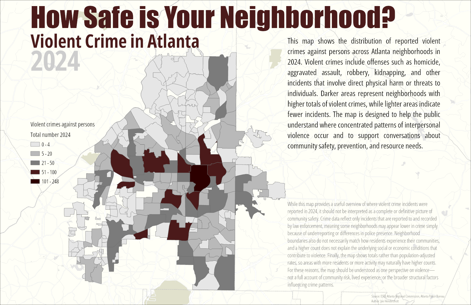
This map visualizes neighborhood-level patterns of violent crime in Atlanta during 2024 using police incident data. For this project, “violent crime against persons” is defined according to the FBI’s NIBRS categories and includes offenses such as homicide, aggravated assault, robbery, rape, sexual assault, and kidnapping. These incidents represent situations where force or the threat of force was used against an individual. By summarizing these events within defined neighborhood boundaries, the map provides a clearer geographic perspective on where interpersonal violence is most concentrated within the city.
I began with a cleaned dataset of all 2024 police incidents, which included a field identifying whether an offense qualified as a violent crime. This layer was spatially joined to an Atlanta neighborhood polygon file, producing a field showing the total number of violent crimes within each neighborhood. Five class breaks were created to distinguish low, moderate-, and high-incident areas. A muted basemap ensures that neighborhood patterns remain visually dominant while still providing geographic context.
The resulting map highlights neighborhoods where violent crime is disproportionately concentrated, particularly in central and south-central parts of the city. These patterns often reflect long-term structural factors such as economic inequality, housing precarity, historical disinvestment, and limited access to social resources. While the map does not explain the causes directly, it provides an important spatial framework for policymakers, community organizations, and residents seeking to understand and address safety concerns. It also reinforces the need for targeted, community-informed violence prevention strategies rather than one-size-fits-all approaches.
While this map provides a useful overview of where violent crime incidents were reported in 2024, it should not be interpreted as a complete or definitive picture of community safety. Crime data reflect only incidents that are reported to and recorded by law enforcement, meaning some neighborhoods may appear lower in crime simply because of underreporting or differences in police presence. Neighborhood boundaries also do not necessarily match how residents experience their communities, and a higher count does not explain the underlying social or economic conditions that contribute to violence. Finally, the map shows totals rather than population-adjusted rates, so areas with more residents or more activity may naturally have higher counts. For these reasons, the map should be understood as one perspective on violence and not a full account of community risk, lived experience, or the broader structural factors influencing crime patterns.
Geography Joe December 11 2025Cartography, Analysis
Violent Crime in Atlanta by Neighborhood
Comments
No comments yet.