

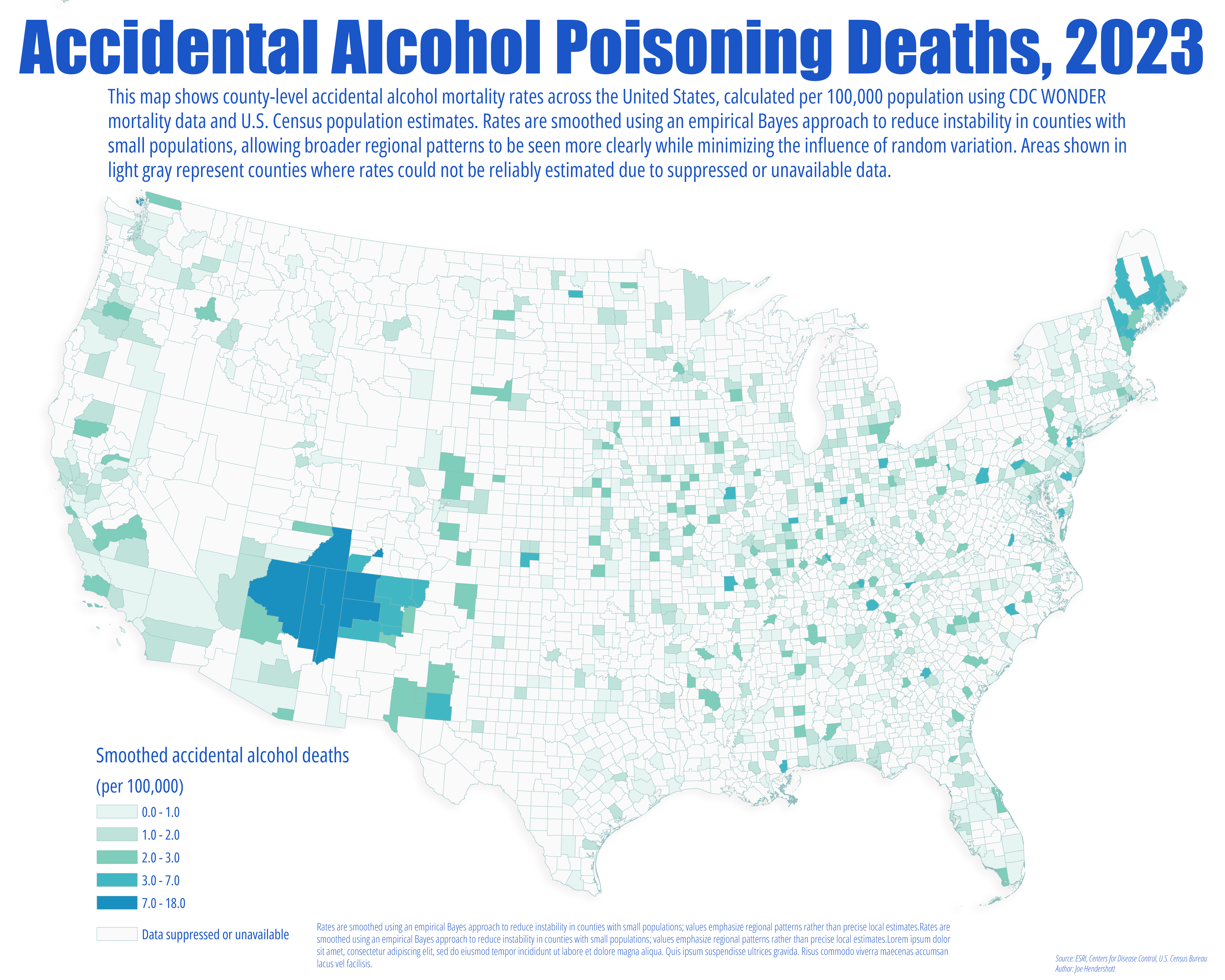
This map examines accidental alcohol-related deaths at the county level across the United States. Mortality counts were obtained from the CDC WONDER database and combined with county population data to calculate crude death rates per 100,000 residents. Because rare events and small population sizes can produce highly unstable rates, particularly in rural counties, an empirical Bayes smoothing technique was applied. This method adjusts extreme values toward the regional mean in a statistically principled way, reducing noise while preserving meaningful geographic variation.
The resulting map is designed to highlight regional patterns rather than precise county-by-county rankings. Darker areas indicate places where accidental alcohol mortality rates are consistently higher relative to surrounding counties, while lighter areas indicate lower rates. Counties shown in light gray reflect locations where data were suppressed or unavailable, often due to small numbers of deaths. These areas should not be interpreted as having zero risk. Together, the map provides a clearer view of where alcohol-related harm is more prevalent across the country, offering context for public health planning, prevention efforts, and further investigation rather than definitive local conclusions.
The resulting map is designed to highlight regional patterns rather than precise county-by-county rankings. Darker areas indicate places where accidental alcohol mortality rates are consistently higher relative to surrounding counties, while lighter areas indicate lower rates. Counties shown in light gray reflect locations where data were suppressed or unavailable, often due to small numbers of deaths. These areas should not be interpreted as having zero risk. Together, the map provides a clearer view of where alcohol-related harm is more prevalent across the country, offering context for public health planning, prevention efforts, and further investigation rather than definitive local conclusions.
Comments
No comments yet.